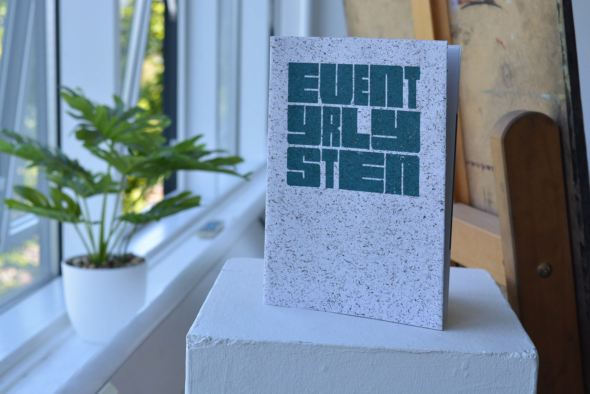
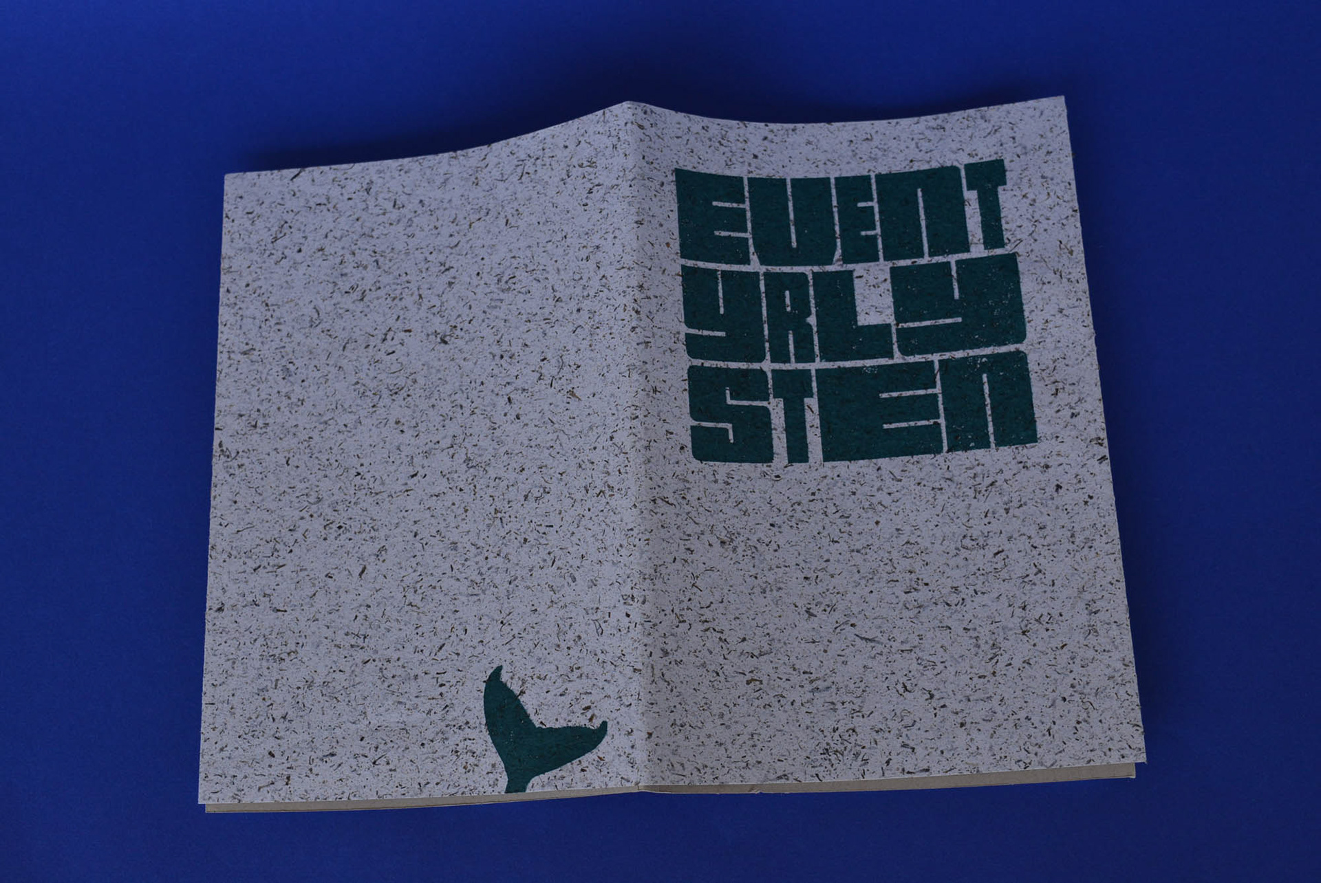
Eventyrlysten
The International Society of Typographic Designers (ISTD)
(Pass)
(Pass)
Editorial, Print
Overview
Eventyrlysten: Discovering Joy in Norway is my response to the International Society of Typographic Designers Student Assessment 2024. The brief centred around the idea of 'Joybringers' and focused on how in an increasingly tense and anxious world, the need for joy to improve mental health and well-being is more essential than ever.
Objective
The brief was clear that not only should personal Joybringers be explored, but also promoted and supported with evidence and lived experience. The audience should feel encouraged and inspired by a typographic tour-de-force to embrace the Joybringers explored.
Research and Development
The project began with looking at finding a definition of joy that could be used throughout to inform the final concept. Through looking at scientific journals I discovered that 'joy is often found between love and surprise' on emotional charts and that joy itself is the result of a 'feeling of communion' with the natural world and our intimate community.
I also noted that the brief mentioned how Finland topped the World Happiness Report year after year and I began to research how a country with such extreme winters could still have such high satisfaction levels.
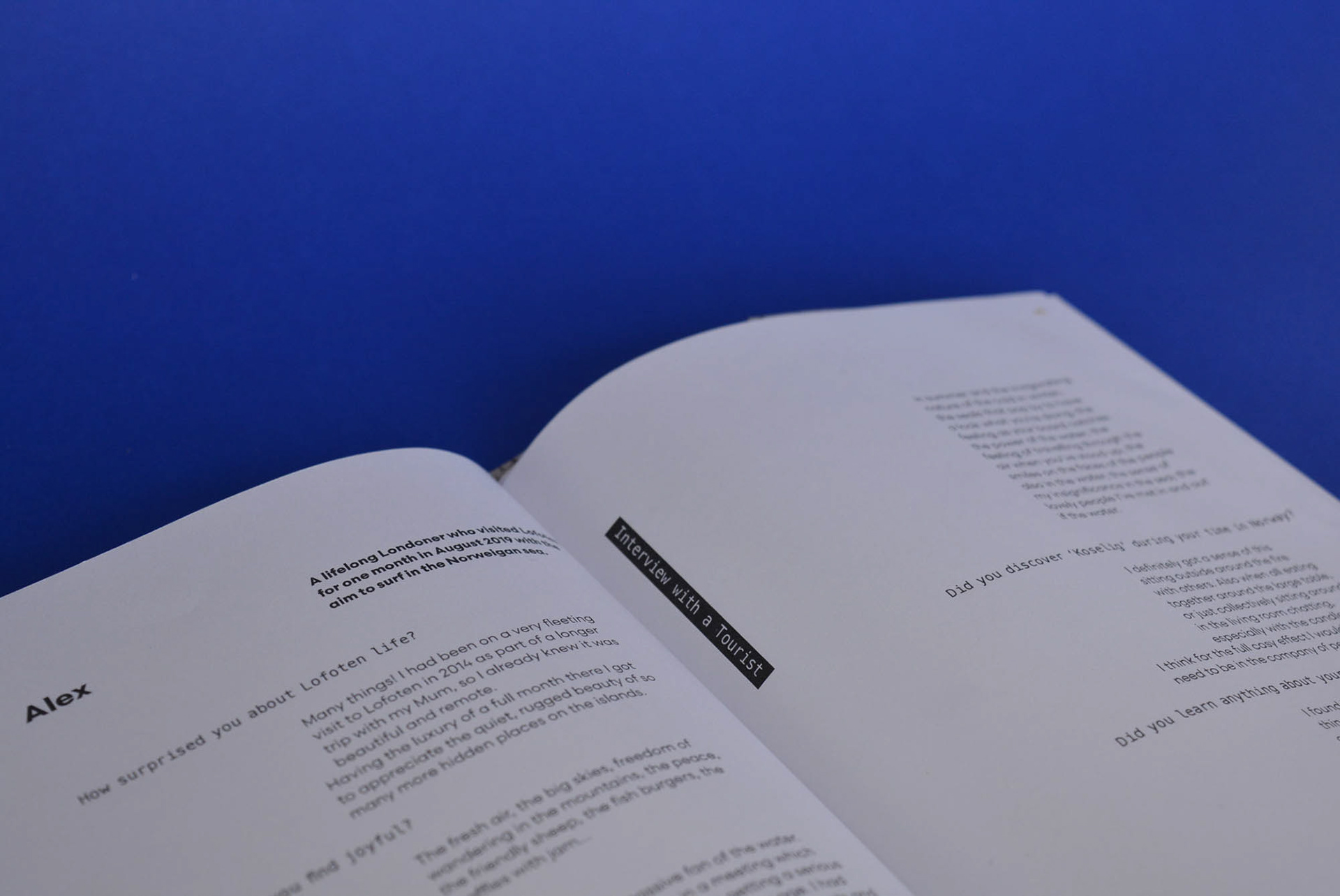
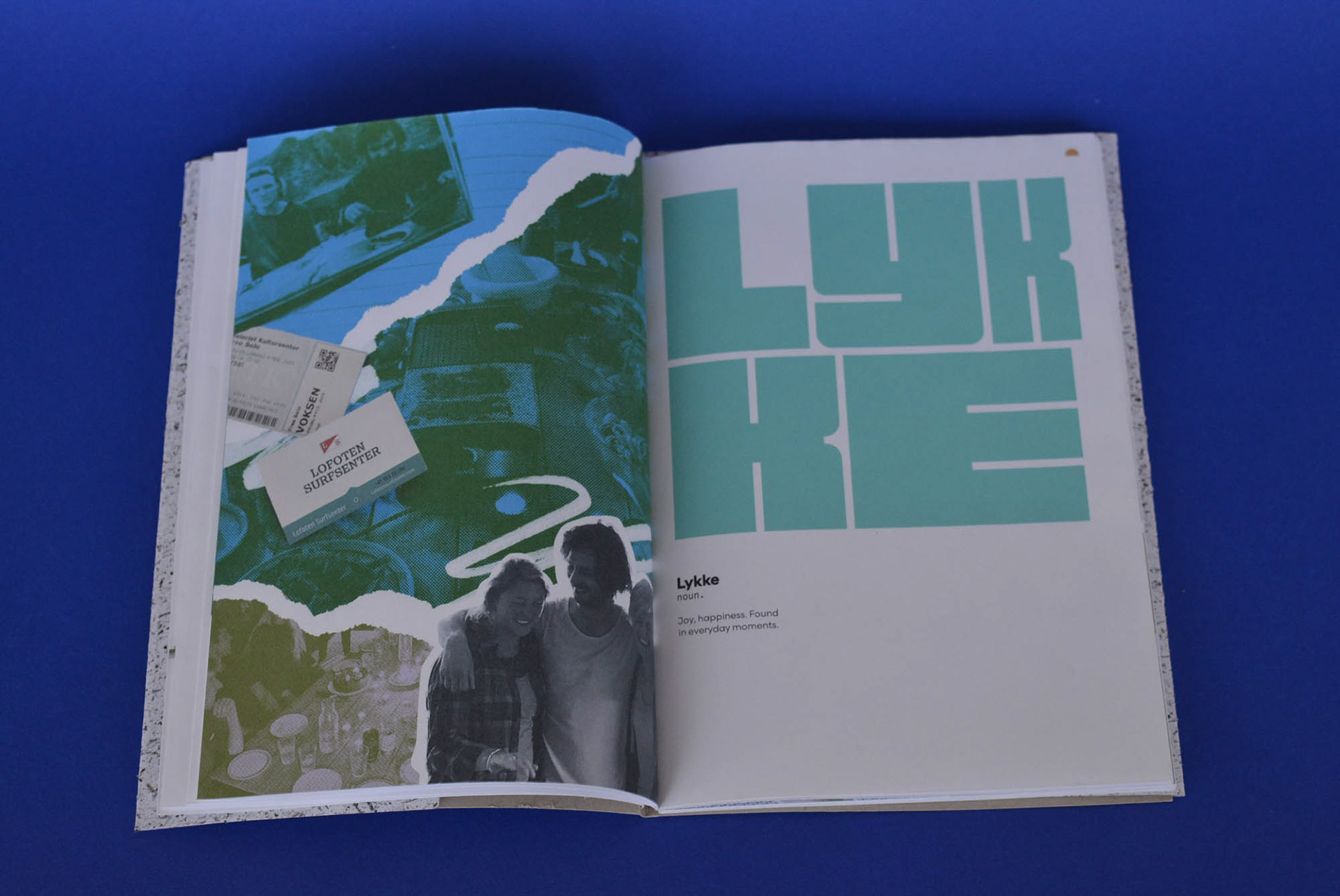
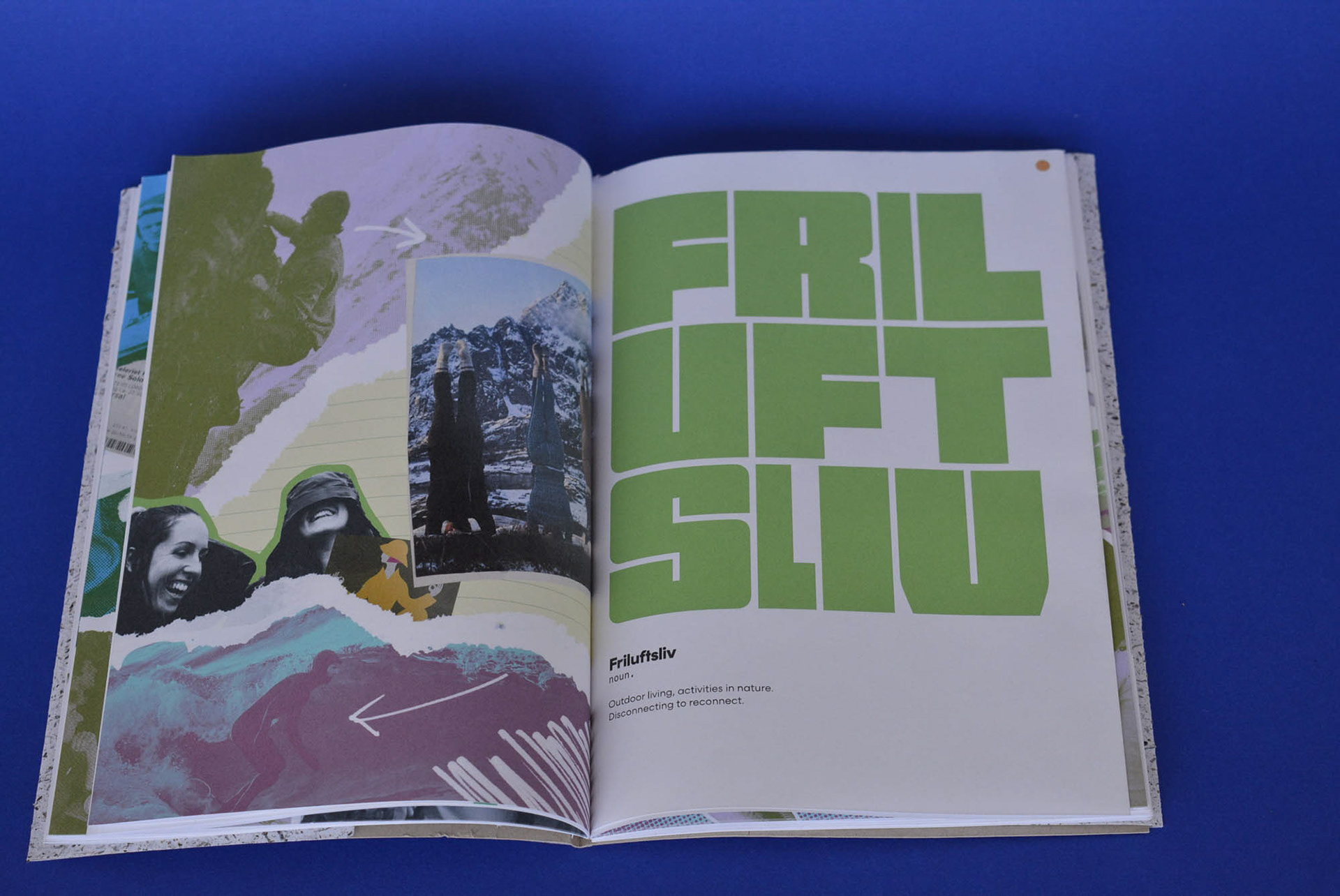
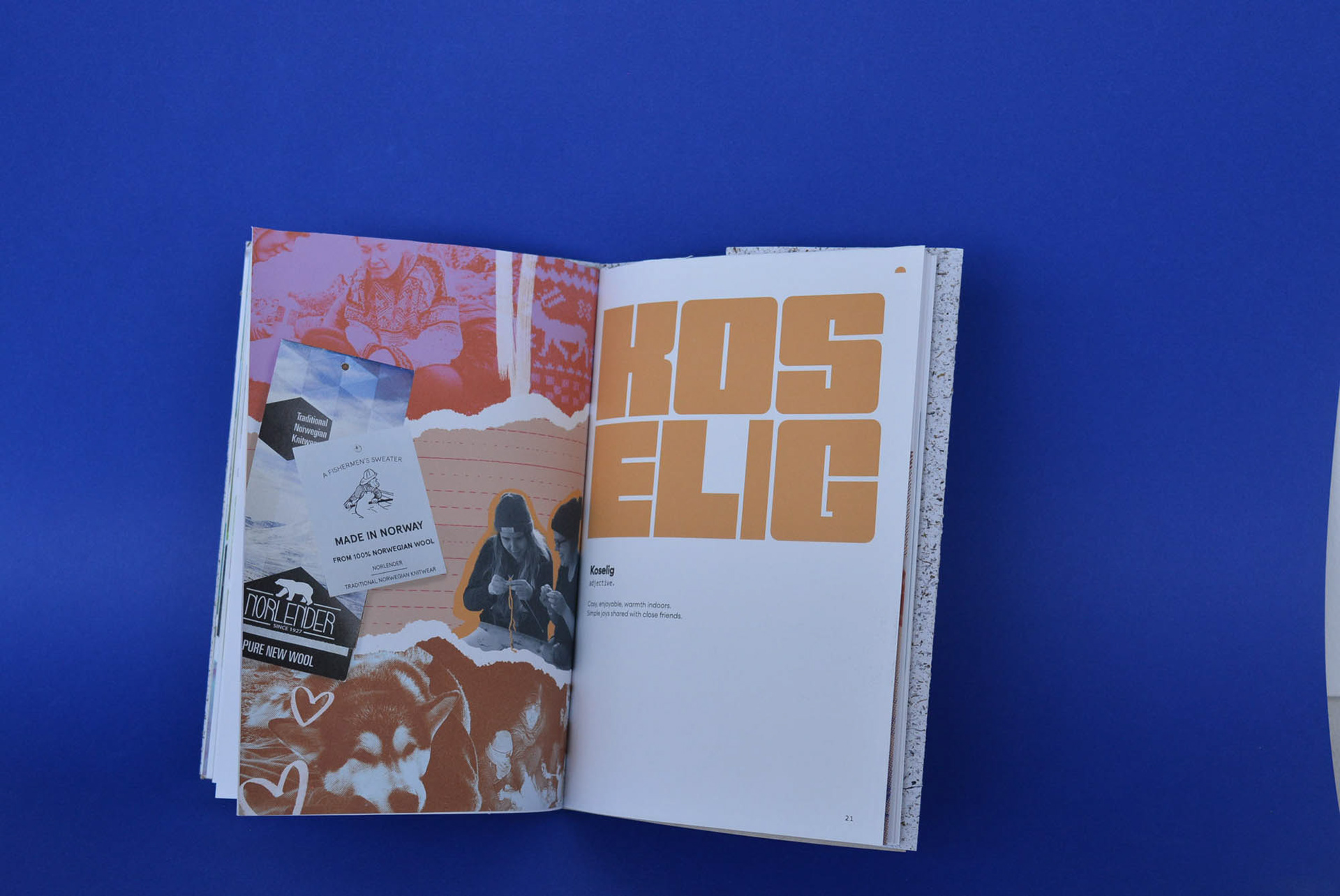
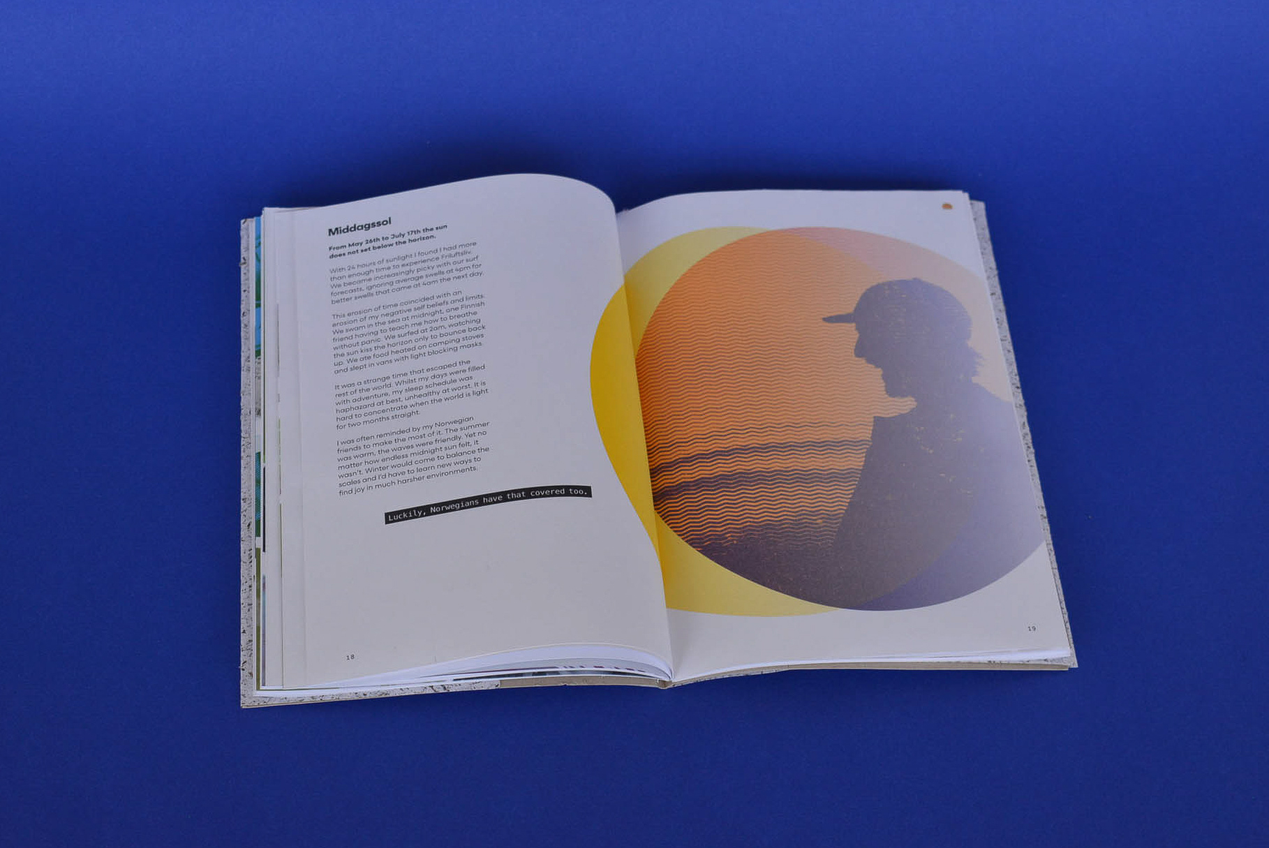
In 2018 I was lucky enough to spend 10 months living north of the Arctic circle in Norway's Lofoten Islands. Despite its remote location (three flights away!), changeable weather and polar night (where the sun disappears for a few weeks), I found new understandings about what constitutes joy through the community I found myself a part of. Intrigued by how I found joy in a surprising place, I shaped my typographic response around three Scandinavian concepts of joy (Lykke, Frilusftsliv and Koselig) to create a travel memoir that shared my own experiences and educated others how they can find joy everyday, wherever they are.
Audience
The audience for Eventyrlysten is adults (25+) who are struggling with mental health and day-to-day fatigue that can become overwhelming in our productivity obsessed western society. This audience was chosen after researching the rising reports of burnout, loneliness and isolation young adults feel as ‘the reality’ of working life sets in. However, the overarching message of the memoir is that joy is found in simplicity, connection (with self, nature and community) and is available in daily doses if we change our approach to it, which is a message open to any audience that’s looking for it.


Strategy and Outcome
To tie the project to my personal story and encourage others to embrace the joy of Norway, I decided to create a piece that was inspired by my own travel journals. This is reflected in the size of the book which is modelled on softback,lined A5 notebooks found in airport bookstores. The paper stock (Gmund Blocker Perfect White 100gsm) was chosen for its crisp white tone that emulated the arctic theme of the travel journal and each page is french folded to prevent any bleeding through in the pagination. In addition, my favourite detail is using GF Smiths seaweed based Notpla paper stock for the outer cover, as the area I lived in was called 'Tangstad' and 'Tang' is Norwegian for seaweed.
Type and Treatment
I wanted both a feeling of nostalgia and excitement to come from this book so that it reflected my personal journey but also inspired others to adopt some of the concepts for themselves. As a result the type was styled to replicate the feel of a memory book or travel guide. In particular the use of a monospaced type reversed on black was selected to feel like Dymo labels embossed on tape. This furthered the analogue, nostalgic theme of the book encouraging less screentime.
I also used typefaces from Scandinavian type foundries (Letters From Sweden) throughout as a way to bring the clean, functional yet characterful nature of Scandinavian design into the piece.
The book is an exploration of Scandinavian concepts that are introduced with section dividers and followed with an explanation of the words' meaning. Throughout the project I was reminded that my stay in Lofoten was ultimately one of the biggest adventures of my life so far. For this reason it is titled 'Eventyrlysten' which means 'adventurous' or the 'joy of adventure'.


Final Outcome
The final outcome was awarded membership to the International Society of Typographic Designers.
Using the form (a memoir designed with Scandinavian influences) to underpin the function of the piece (inspiring joy through Scandinavian philosophy), the final outcome fulfilled both the brief and my own personal desire to create a memory of an informative time in my own life.
Feedback noted the ‘care and a clear intention which, ultimately, utilises typography in an appropriate and controlled way’ across the piece, with particular emphasis on the strategy and research that lead to an accessible form of communication:
'The language felt accessible (which set the scene well for the rest of the work) and you provided a rationale for your design system. Importantly, there was a clear relationship between the form and the content.'
Tools: InDesign, Illustrator, Photoshop
Printer: Vivid Print on Gmund Blocker, University of Portsmouth CCI studios
Fonts: Letters From Sweden
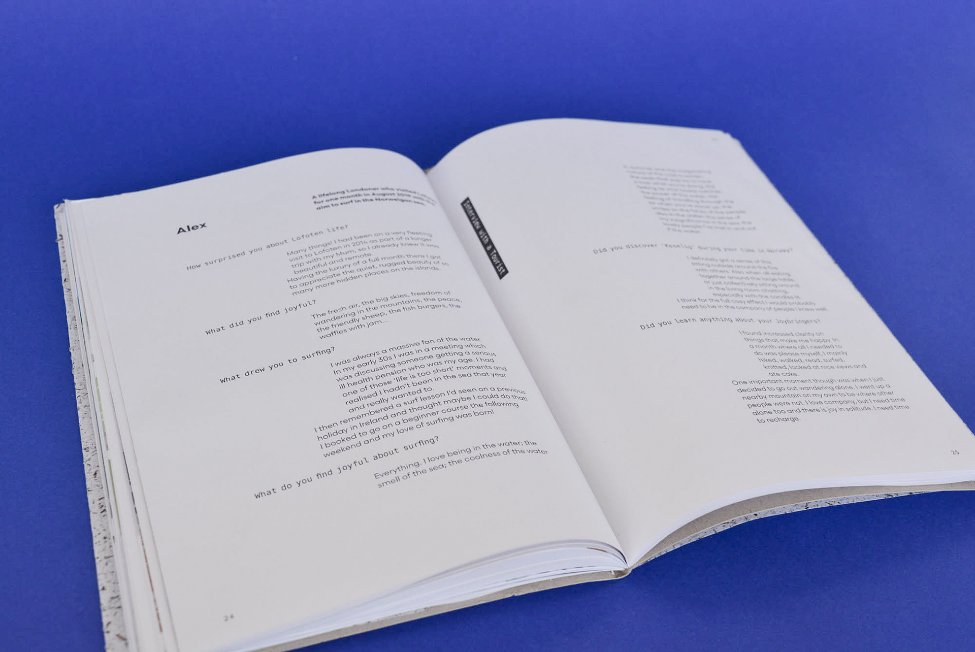
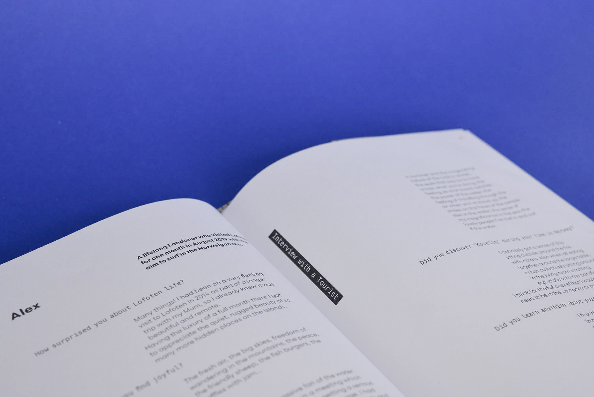
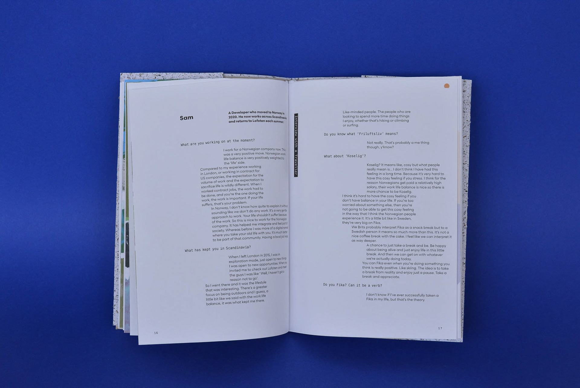
Collaborators: Sam Billingham, Rolf Oftedal, Alex @surfinglibrarian
Tutor: Dan McCabe
Printer: Vivid Print on Gmund Blocker, University of Portsmouth CCI studios
Fonts: Letters From Sweden
Collaborators: Sam Billingham, Rolf Oftedal, Alex @surfinglibrarian
Tutor: Dan McCabe