
Restaurant Stresa
Brand Identity and Web Design
This is a brand concept and project created by Right Aligned and featured here. The challenge was to design an identity that reflected Restaurant Stresa's ambition to become the world’s largest Italian street food brand.
The new brand needed to showcase Restaurant Stresa's offering that uses fresh, seasonal ingredients to create delicious, on-the-go food for young professionals that are time poor but continually seek new experiences and tastes. As digitally savvy individuals they understand the power of social media and it’s impact on food trends. It was crucial the design stood out online.

Research and
Mood Board
Mood Board

The client expected a fresh brand that captures the heritage of Restaurant Stresa whilst communicating with a new generation of foodies. The aim was to be bold and brave without loosing the essence of who Restaurant Stresa are and their heritage.
The creative process began with initial research by looking at what is already available in supermarkets and competitors to understand the market the client operates in. This led me to understand the visual language of competitors and trends consumers were engaging with.
Looking at indie food such as The Dough Bros, Bambino and grass root foodie brands such Goat Shed showed that type-led identities, paired with more organic hand drawn elements (whether a looser font or illustrated doodles) created fun, yet effective, versatile identities that worked well online and in print.
I also headed to a local bookstore to identify how Italian food in particular is celebrated editorially in cook books and travel journals. The start simplicity of bold type paired with consistently styled images visually showed how Italian food’s foundational quality and ingredients shine in the dished without having to over complicate.
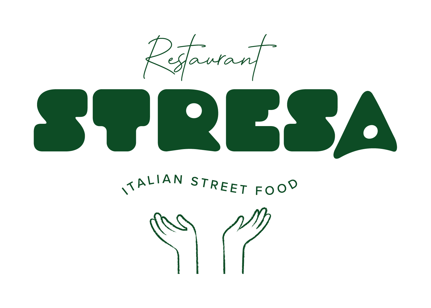
For Restaurant Stresa, a bold display typefaces was used to bring in modern edge, whilst a more traditional serif is used to convey heritage and experience.
Strategy and Development

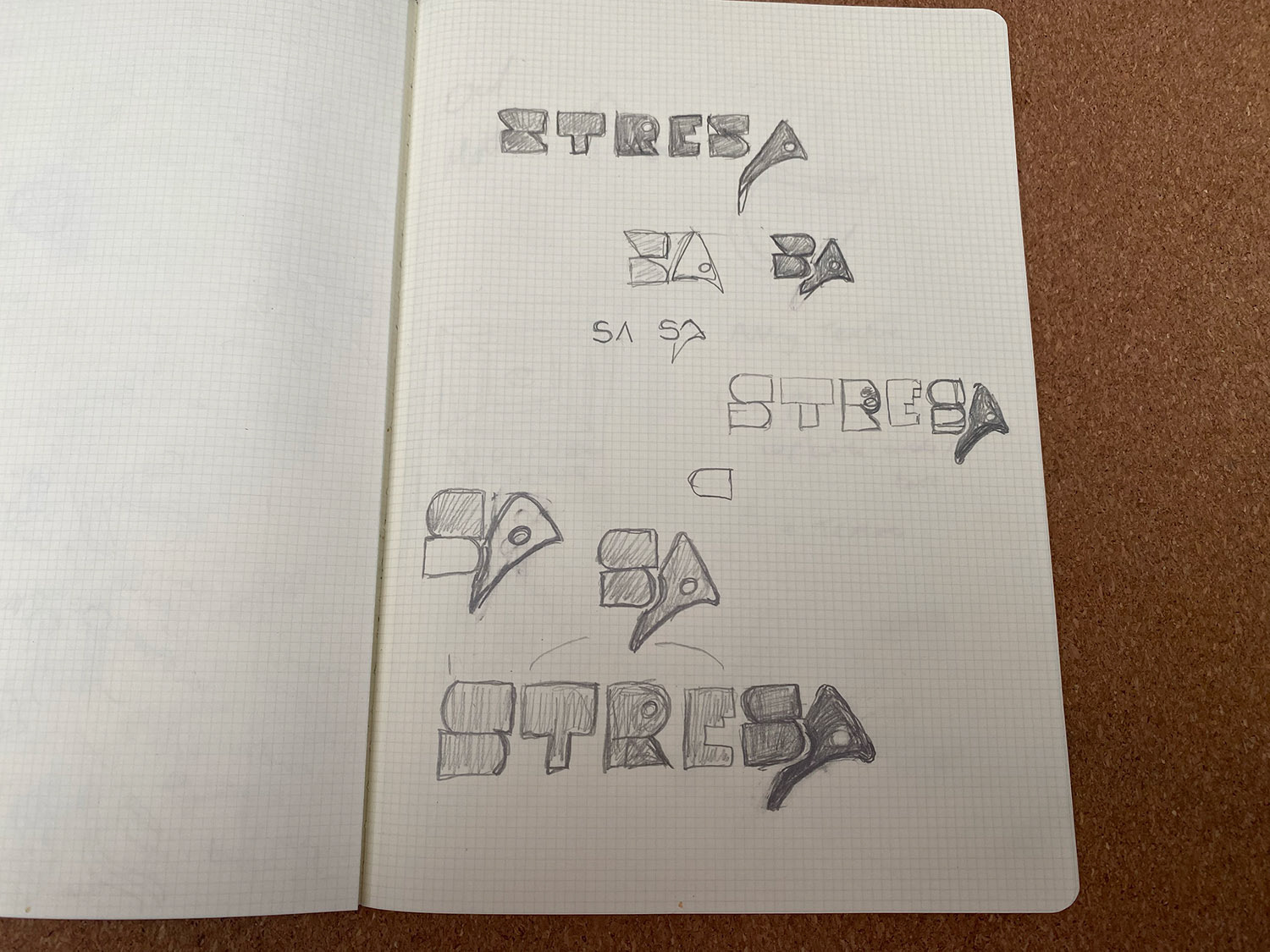
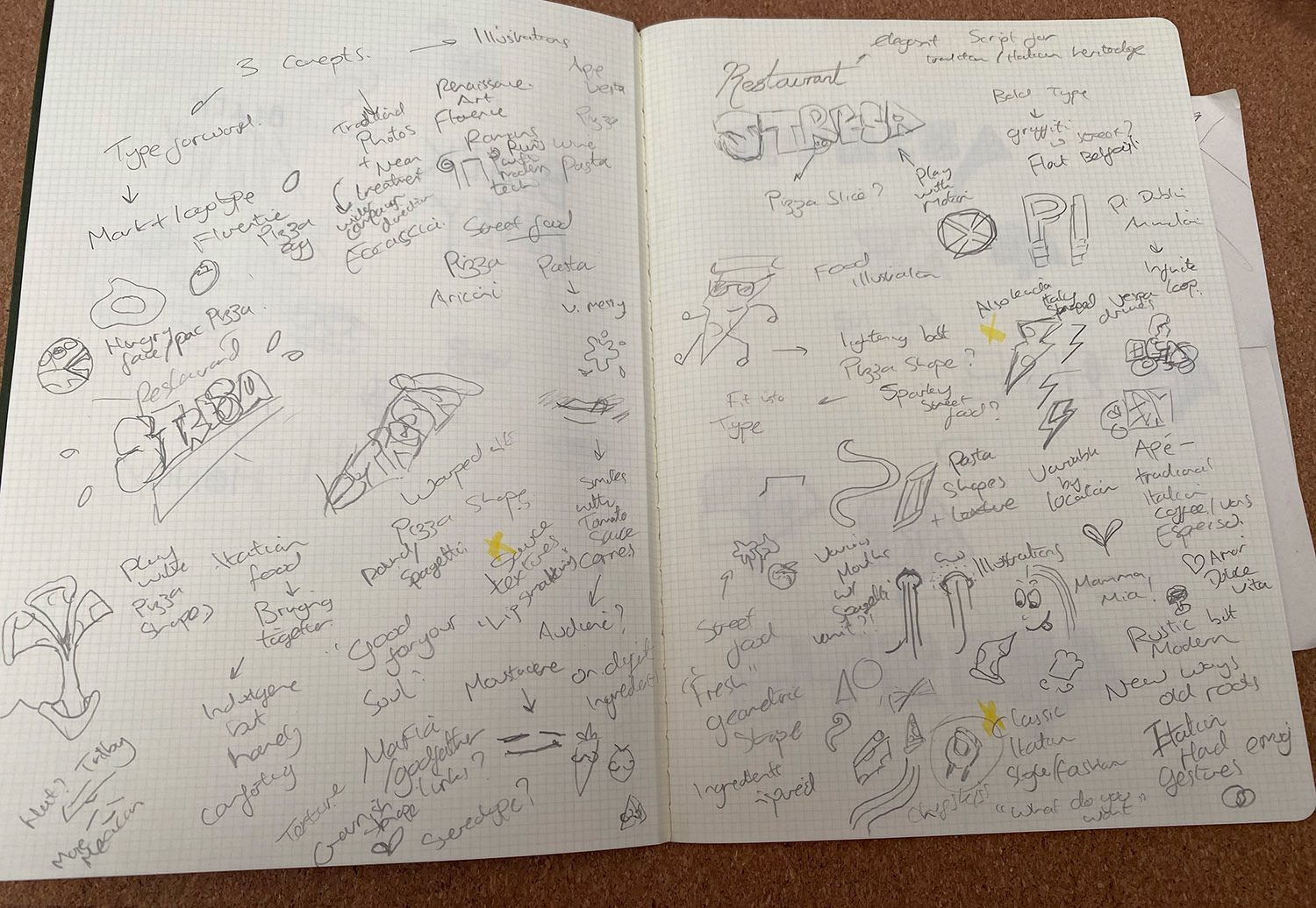
Using the visual cues and research from similar brands, competitors and the cook books, I mind mapped ideas within a set time frame to challenge myself to work quickly and intuitively. I didn't want to worry about perfect renditions or spend too long on an idea in order to let the creative process unfold organically.
Key ideas I choose to pursue from this initial idea generation session included incorporating the recognisable triangular shape of a pizza slice into the wordmark and also leaning into traditional Italian imagary such as vespa deliveries, Piaggio Apes (a vespa inspired three wheeler often used for food and coffee trucks in busy Italian cities) and iconic Italian hand gestures to being through the brands heritage and roots.
After experimenting with a high contrast typeface to convey quality, but shelved this idea as it did not stand out enough and looked too 'safe' to be a dynamic brand and concept.
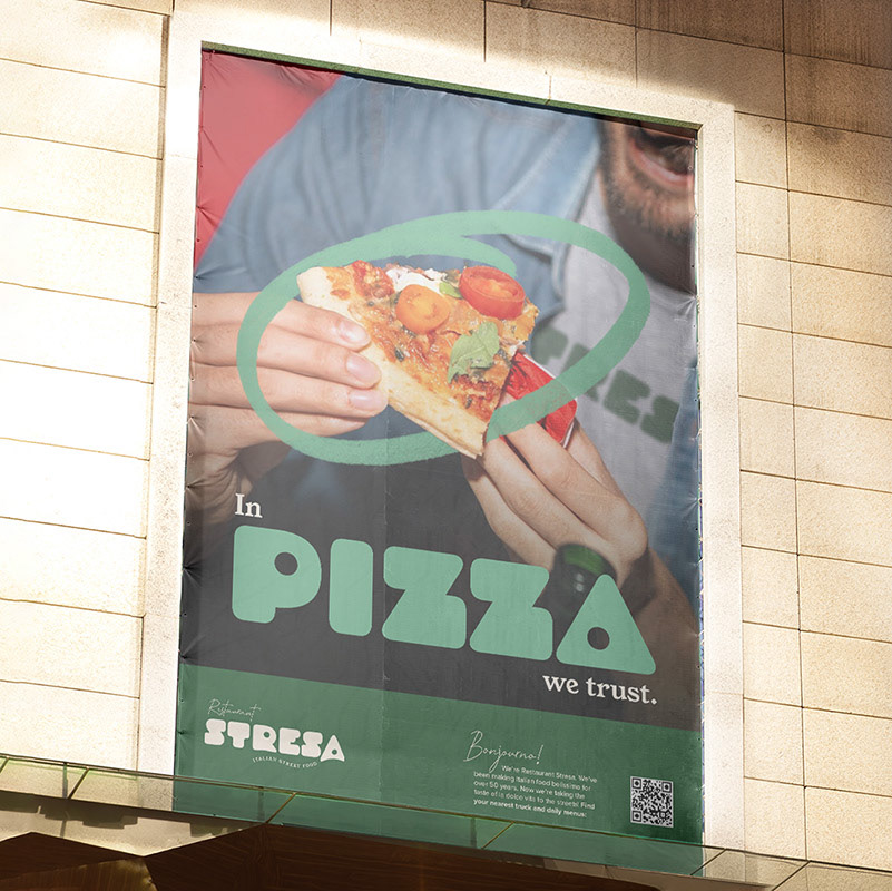
I opted instead for the display font Droog, which is both retro inspired but futuristic thanks to it's rounded appearance pierced with circular holes, some of which are used in lieu of counters. The pierced hole in the last letter A also resembled a pepperoni slice on a pizza, giving me the chance to modify and play with the letter to make the logotype unique.
Type and Pattern
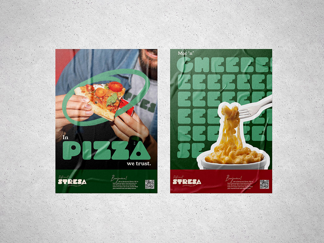
The heavy geometric nature of the typeface created a lot of potential around creating patterns and icons that integrated with the wider design. My initial idea was to bring the food of Restaurant Stresa into the design elements. With the Droog heavy variant, I was able to create pasta shapes, olives and the all important pizza slice inspired by the type.

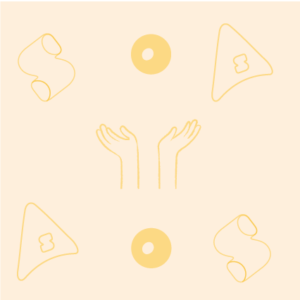
Image and Illustration
The original art direction idea for the new brand was to play with nostalgic imagery from the streets of Italy throughout the 1950s, which was the decade Restaurant Stresa was founded in. I wanted to play with the contrast of old imagery with the new, bold type face. Whilst this worked, it didn't 'wow'.
Returning to the research, I'd identified that organic, loose illustrations are often used to convey a sense of personality on branding in the food space. I decided to pursue the idea of conveying Restaurant Stresa's passion for food through illustrating iconic expressive Italian hand gestures.
After adapting and editing stock illustrations, I settled on three key gestures: the pizza throw, the Italian pinch (often used to ask what do you want or to emphasise a point) and the ok/chef's kiss hand gesture to signify enjoyment and quality.
Playing with the shape of the sub line 'Italian Street Food' to represent pizza dough mid air gave a new variant of the logo whilst placing the Pizza/letter A icon from the word mark encouraged the idea of receiving good food with joy.


Final Brand and Rollout
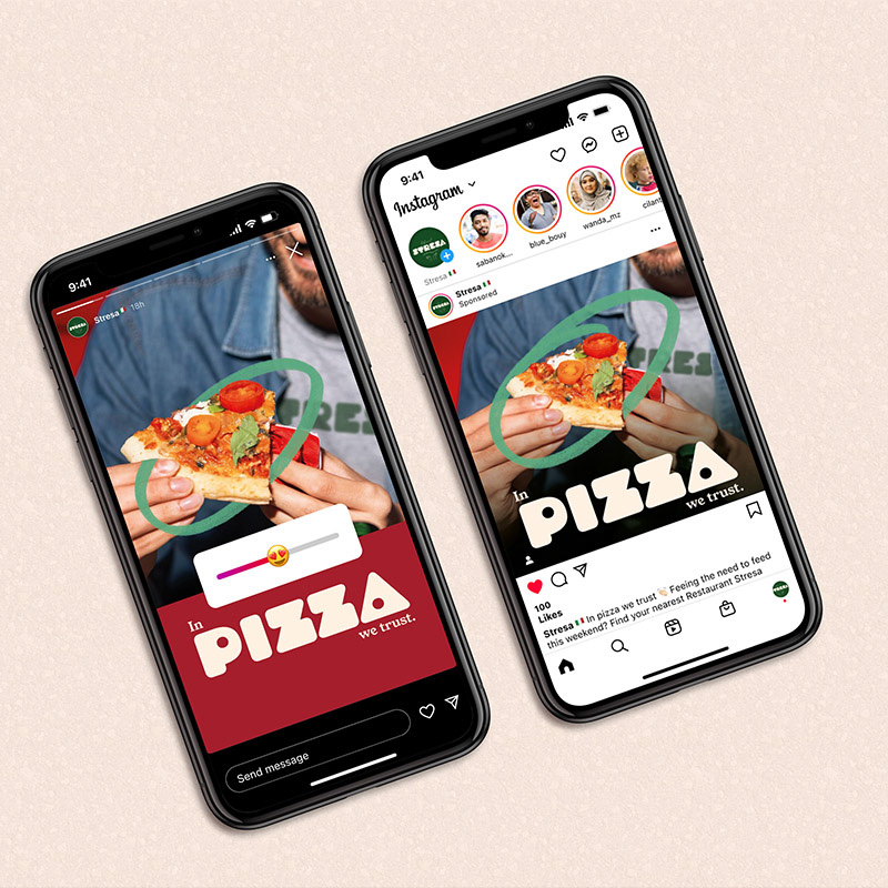
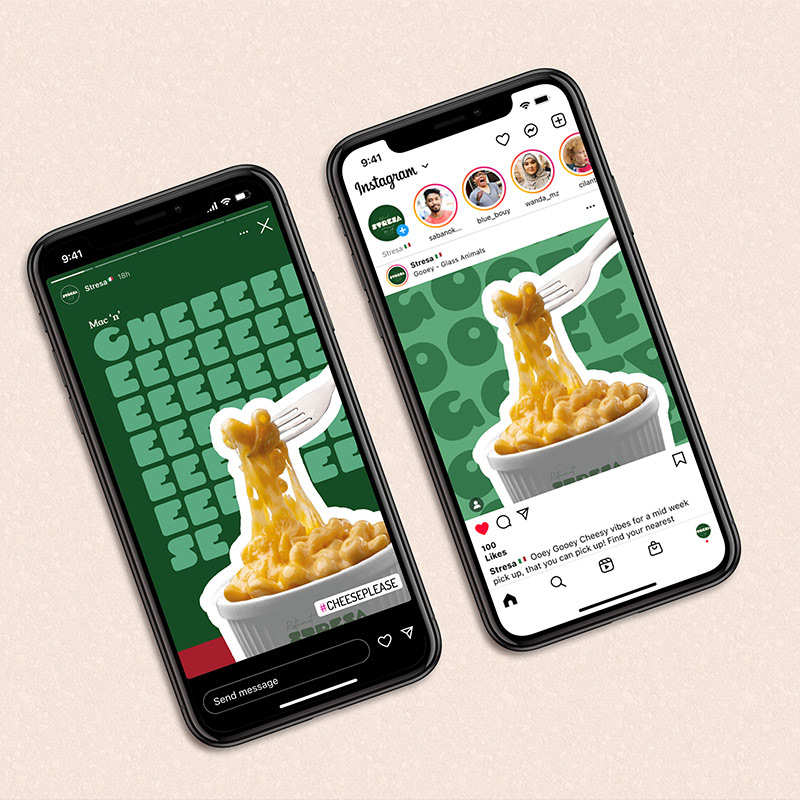
Social Content
The target audience for Restaurant Stresa is young professionals who are time poor but seeking new flavours and food experiences.
As digitally savvy individuals they understand the power of social media and it’s impact on food trends and it is crucial the design and brand stands out and engages on busy social media feeds.
This is a selection of Instagram posts and stories to show how the brand can be used to stand out and engage online. When teamed with playful copy and a passionate tone of voice, the brand visuals become versatile assets that are eye catching and encourage engagement.
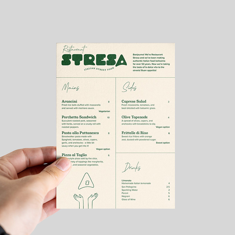


Web Design
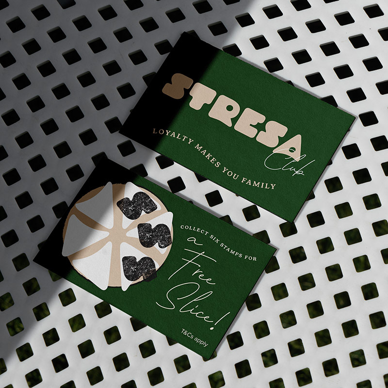
To complement the new brand, the client needed a new, responsive website design and mobile app. Whilst online ordering platforms such as Deliveroo and Just Eat would be used for order fulfilment and delivery, the Restaurant Stresa app would be used as part of a wider digital strategy to show van locations, daily menus and a digital loyalty card app.
The responsive website was designed and prototyped using Figma, ready to be developed following sign off. The website balanced the new brand with a focus on UI, with accessibility, colour contrast and clear hierarchy for ease of use being a priority.