Amicus Maleficarum
A modern witch finding manual to banish cursed stereotypes of femininity, feminists and fear of the other.
Editorial, Print
Overview
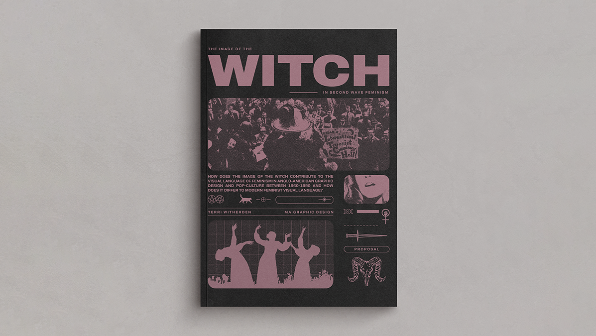
The Resolution of my Graphic Design MA explores the relationship between the image of the witch in pop culture and society's representation of women. Amicus Maleficarum was designed to explore the root of stereotypes of women, witches and feminists in order to debunk the harmful narratives and create an accessible guide and introduction to feminism.
The goal was to subvert something hateful and destructive towards women, witches and the other in society into something inclusive and supportive. This research through design is an exploration in using graphic design to communicate feminism with a new lens and broaden wider understanding of the topic.
Context
The Amicus (meaning friend) is a subversion of Heinrich Kramer's The Malleus Maleficarum (Hammer of Witches, 1486). The Malleus, a witch-finding manual that was consulted throughout the witch craze that killed thousands between 1500-1750, has been called 'the most misogynistic text ever written' (Silva Federici). It is the first instance of witches becoming exclusively female and is a potent example of the gender ideologies, fear, lust and power in Early Modern Europe. The conditions that lead to the success of the Malleus (climate catastrophe, changing social structures, erosion of national and individual identity) are not too dissimilar to today and the widening global gender divide and exposed everyday misogyny means that discussions of women, gender roles and equality are more relevant than other. By tracking the image of the witch in popular culture, we can track social shifts in attitudes to women, and the other, with power.
Research and Development
Through eight months of creative practice and wider contextualisation with a Literature Review, I developed the understanding that the image of the witch is not just a representation of women, but a representation of the ‘other’ in society. In a patriarchal society the other is female, and as a result discussions of feminism (past and present) needed to be present and understood.
Visual Language of Second Wave Feminism
This lead to an in depth exploration into the print culture and visual graphic literature of second wave feminism between 1960 and 1990 in America and Britain. Through wider reading, exhibitions and contemporary sources I identified reoccurring visual motifs (such as the Women’s Movement symbol and manifestos written with typewriters). I also deepened my understanding of the techniques and materials used in the movement and understood how the leaflets, pamphlets, posters and placards created to unite the movement played an integral part in the spread of the message. I also came to understand the strengths and weaknesses of the movement and the postfeminist response that followed.
Understanding Feminism beyond the stereotype of the angry woman who doesn’t shave their legs became an important goal of the project as stereotypes are used to belittle and dismiss the call for equality. This focus on making feminism accessible was a driving purpose of the project, but it was a challenge to balance educating others without overwhelm or alienating them further from the cause. bell hook’s 'Feminism is For Everybody' became a phrase I said often when discussing the work.
The Image of the Witch
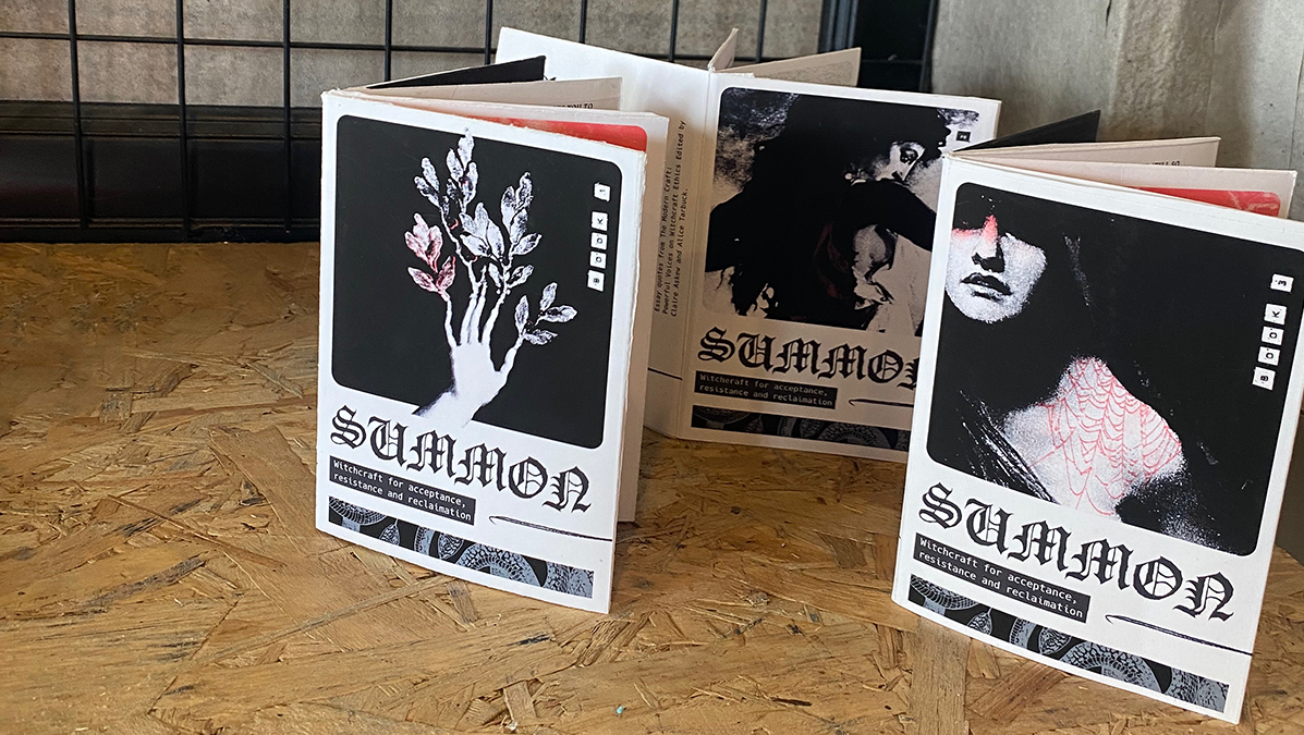
Alongside the study of 20th century feminism, I looked at the changing perceptions of the witch in public culture. This was predominantly on screen and in politics. It became clear that as women became more visible in society due to feminist waves, the depiction of the witch deepened and became more complex. Subversions of the wicked woman on the edge of society include the introduction of the helpful teen witch, the housewife witch using her magic to support her family and the retellings of classic stories from the Witch’s point of view.
Like women, the image of the witch was subject to reoccurring tropes, such as the child hating hag or the sexy enchantress, which led me to understand how the presentation of the witch is a presentation of social expectations of women. Often the witch’s identity is centred around a male narrative, what is she in relation to men in society? Whilst I had initially believed when I began my project that the witch was a feminist icon raising a bony middle figure to social norms, postfeminist retellings of the witch (such as 1996’s The Craft) showed that the image of the witch is not immune to patriarchy and in in fact can be used to endorse and implement it.
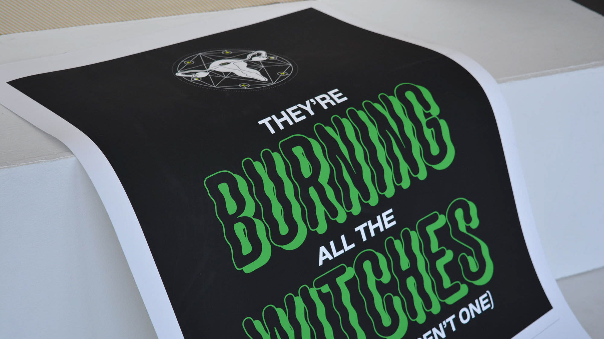
The opposite is also true. I discovered through my research that a witch is always a representation of the other. Like radical feminism, the witch calls for current systems to be dismantled and replaced. This is both attractive and frightening. The witch is also not exclusively female as Kramer identified in 1486 in his anti-woman propaganda, but a representation of the other. In this way, the image of the witch can be a champion for oppressed minorities, not just women.
Outcome
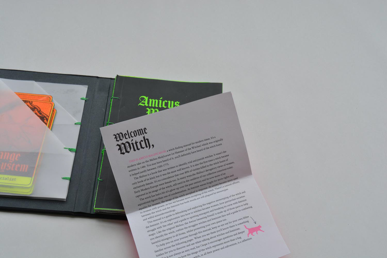
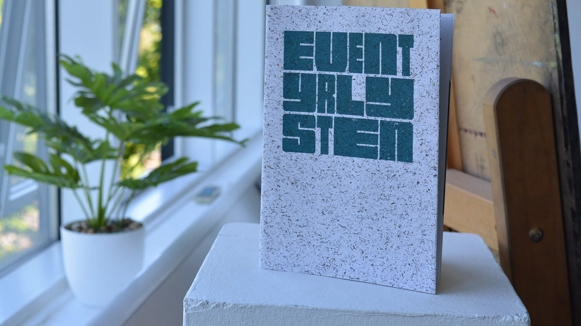
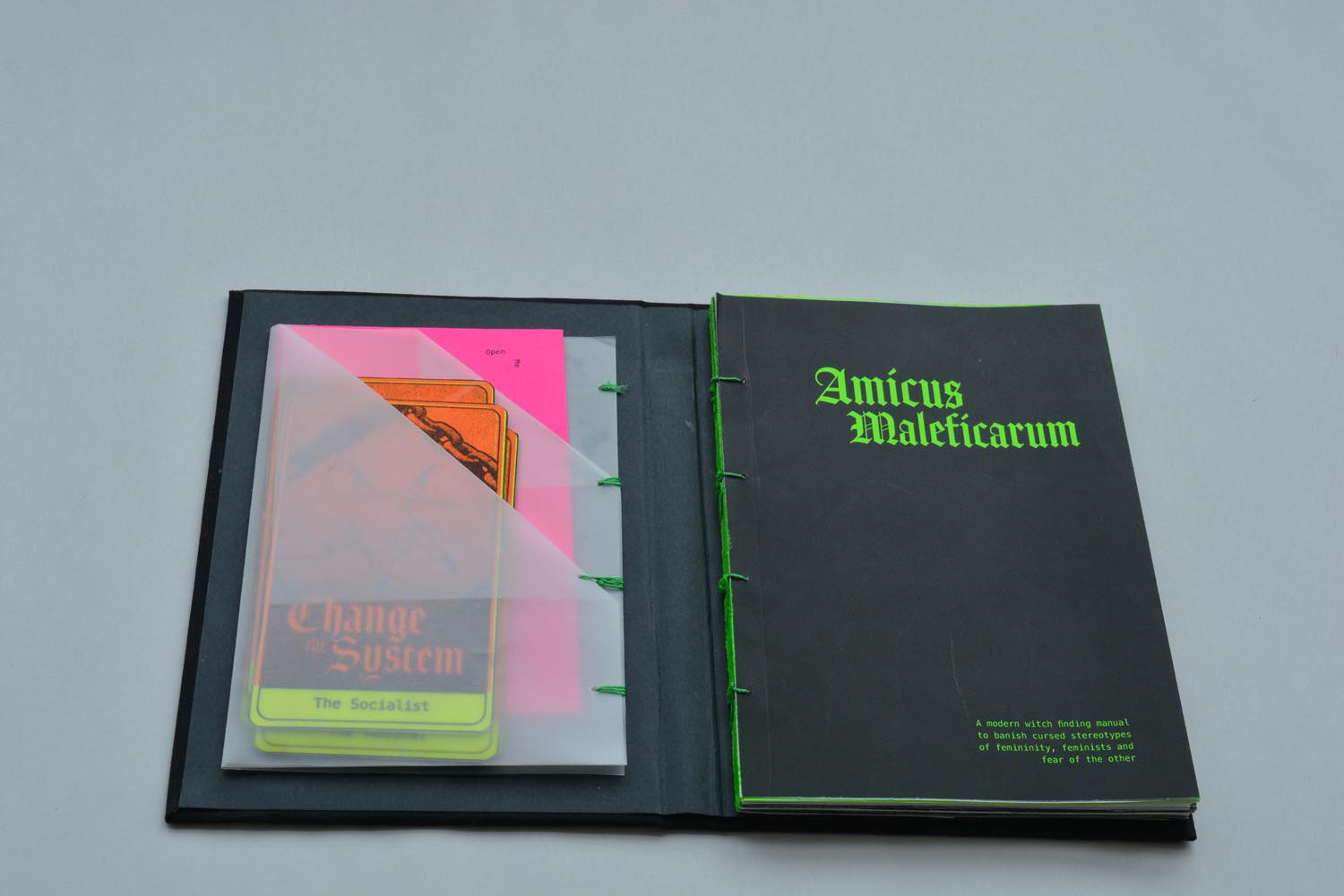
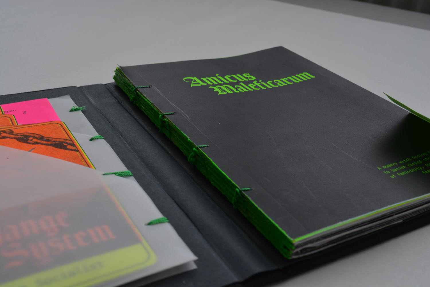
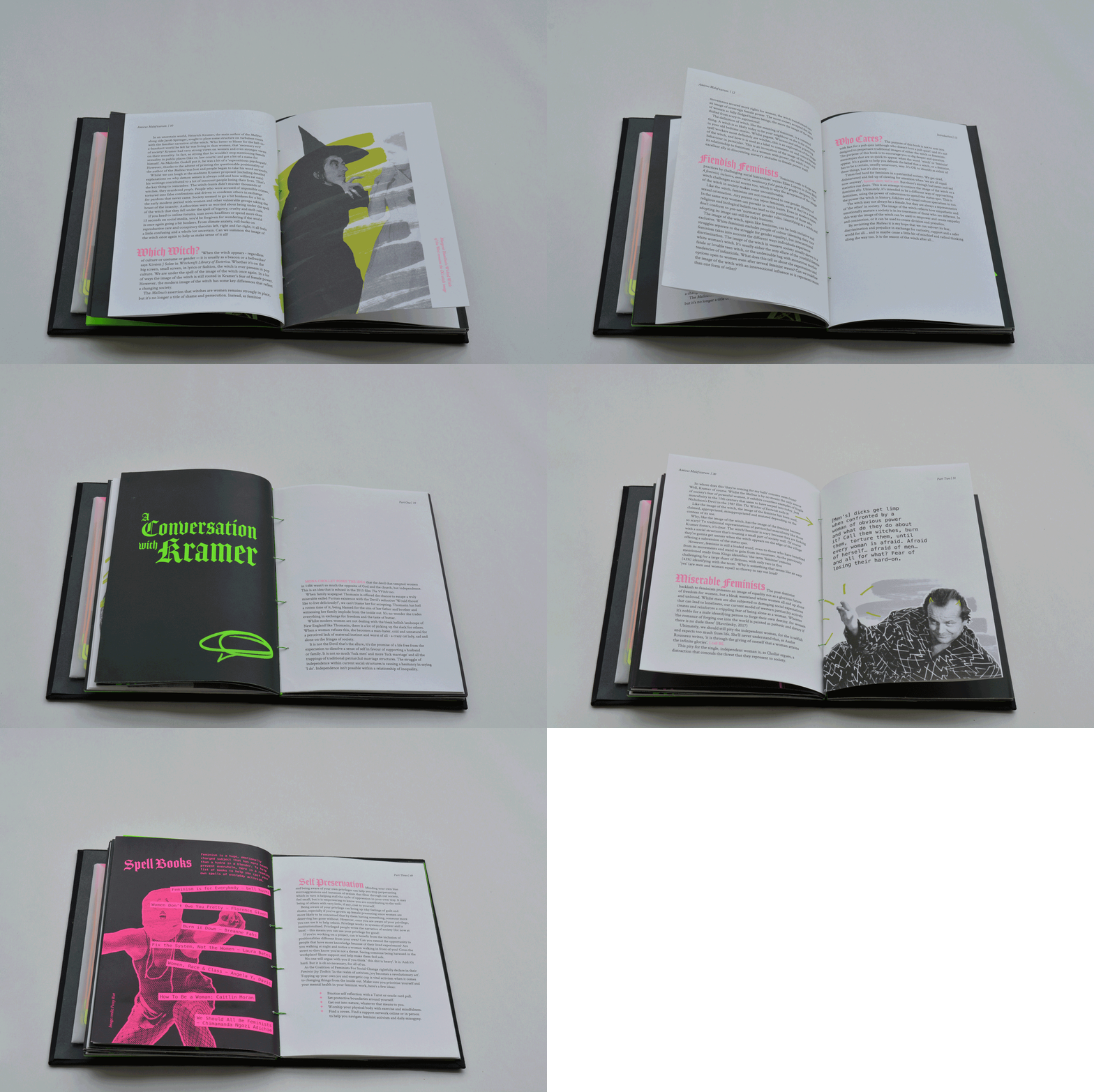
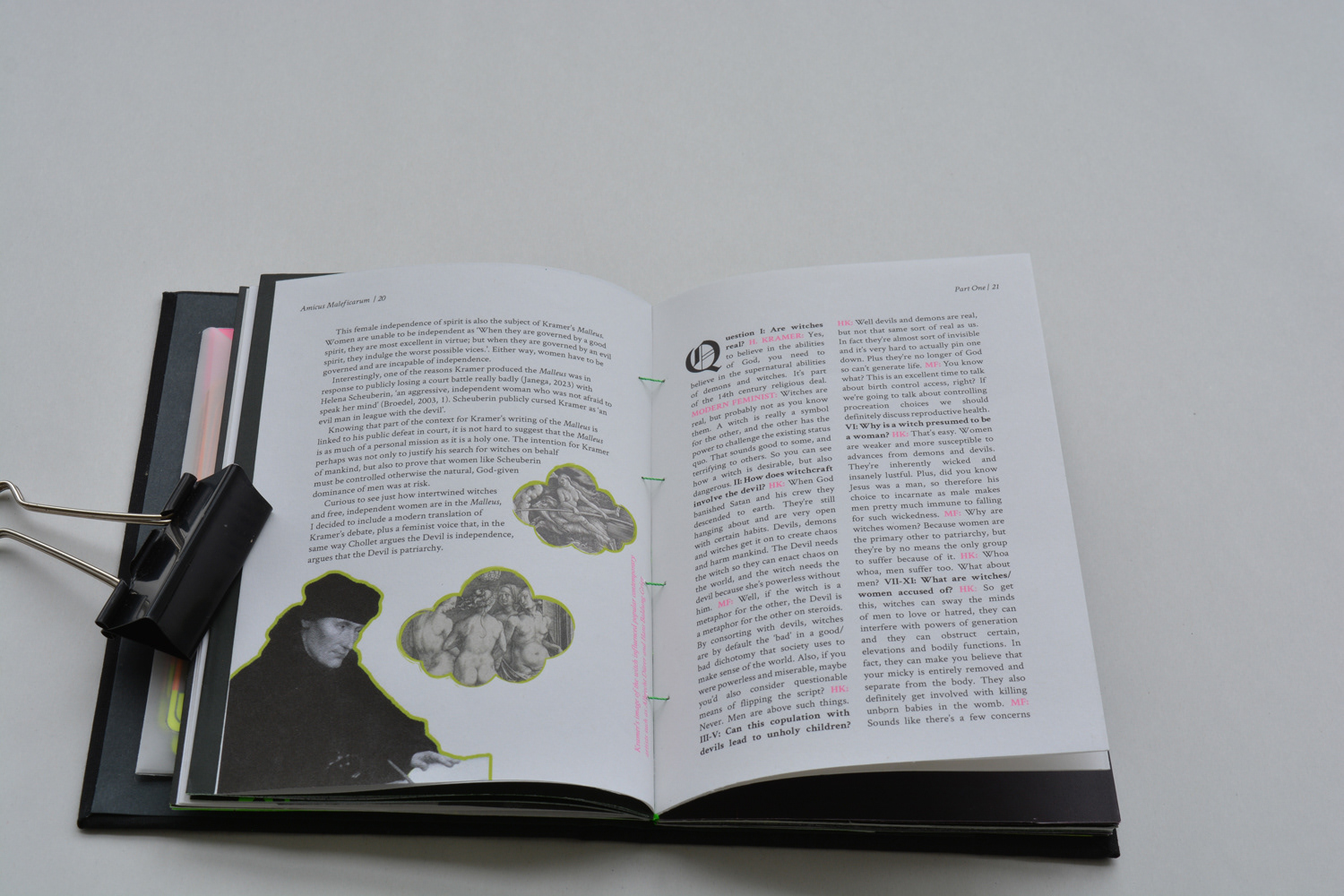
The final Resolution for my MA is a small, hardback book entitled Amicus Maleficarum: A modern witch finding manual to banish cursed stereotypes of femininity, feminists and fear of the other. The book is divided into three sections around identifying the link between witches and women, how to spot acts of oppression and how to combat them. The content was written with a tone of voice that is both playfully curt but never dismissive or patronising.
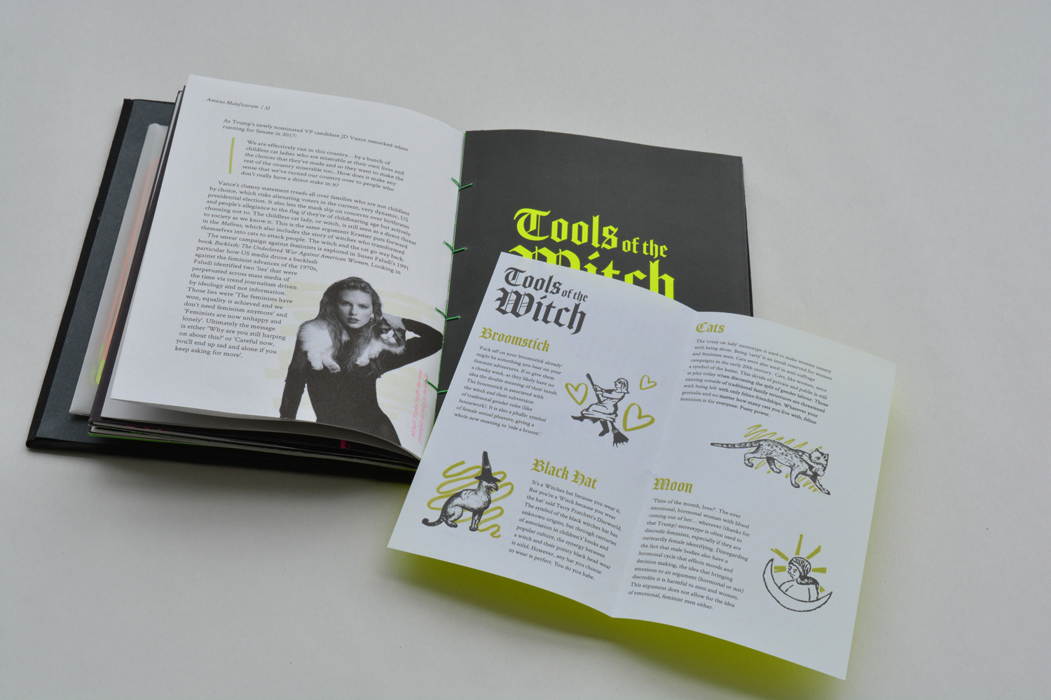
The form (hard, Swiss bound case with interactive folded pockets and tip-ins) is somewhere between a portable field guide to feminism and a spell book. The tip-ins are distributed throughout the book and signified by a cut out cat motif that displays a contrast between dayglo paper and the block printed black background.
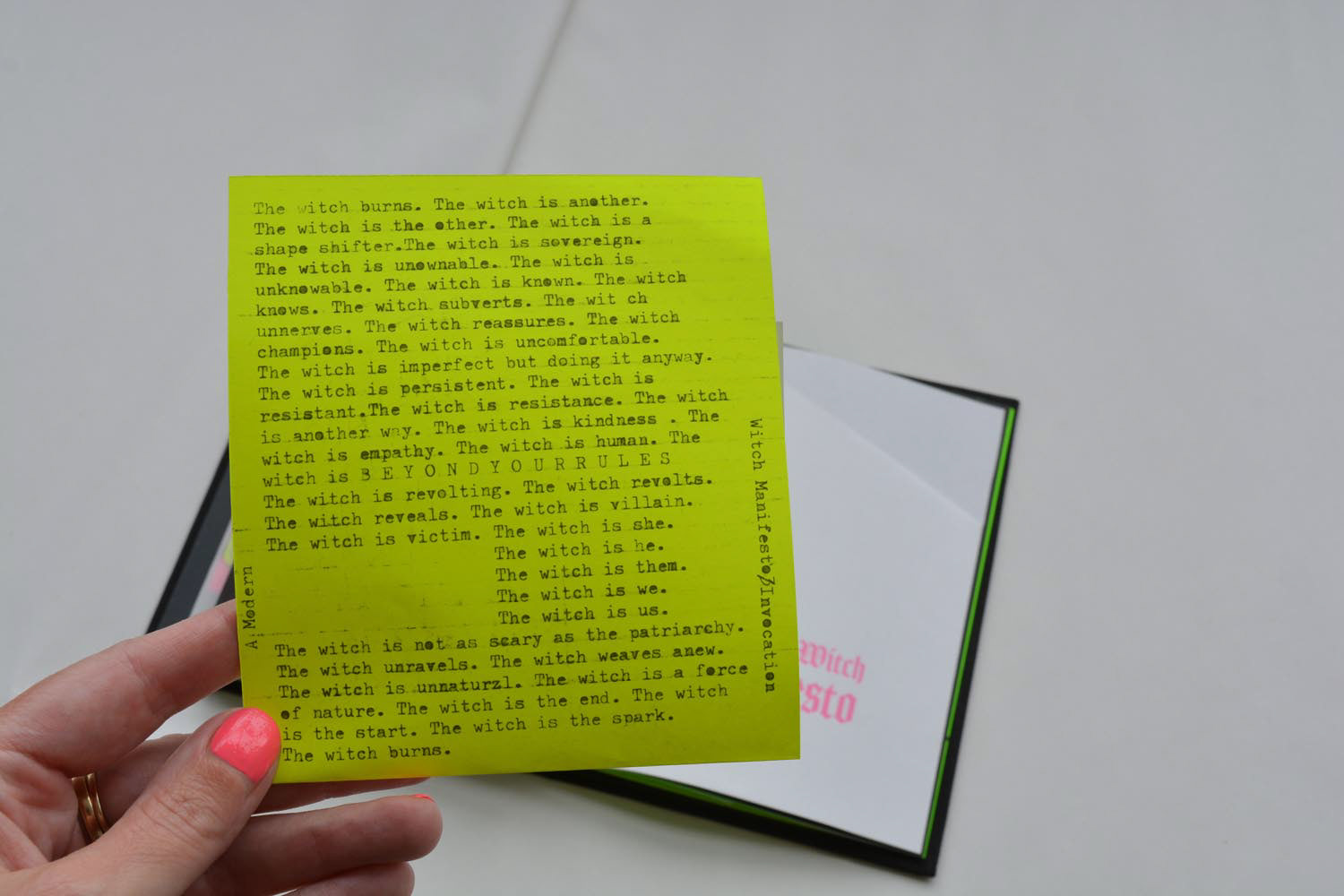
Each tip-in is designed to be a tool to understand the content more fully. Some are playful, some act as more of a visual guide. The final tip-in is a ‘Modern witch manifesto’ typed with a 1960s Olympia typewriter, reminiscent of the second wave feminist manifestos I’d encountered in my research.
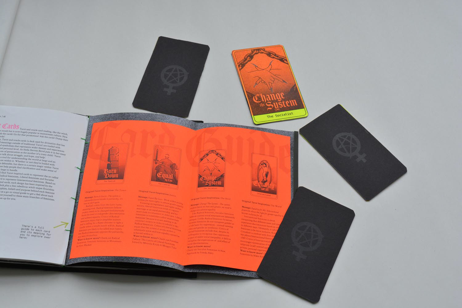
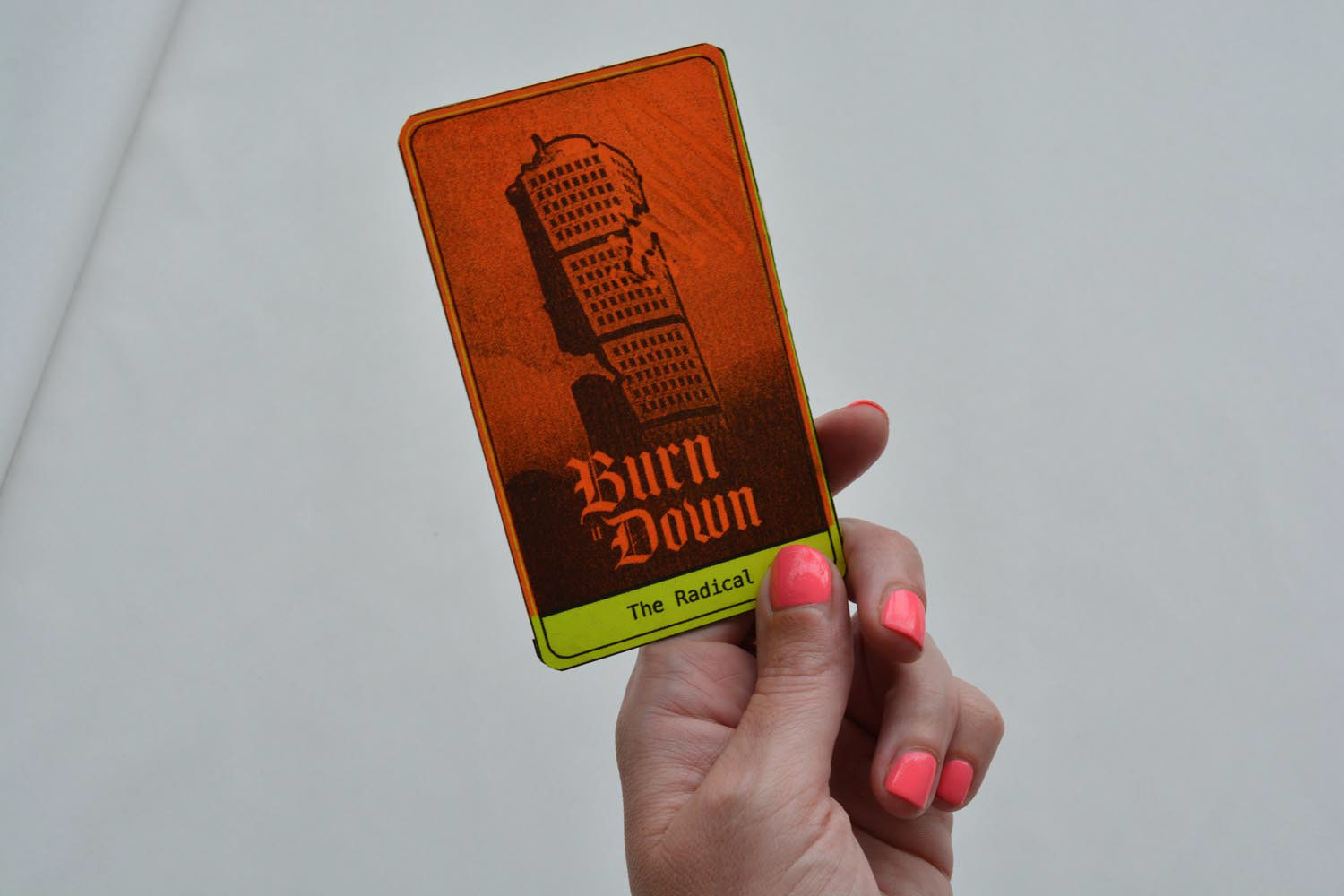
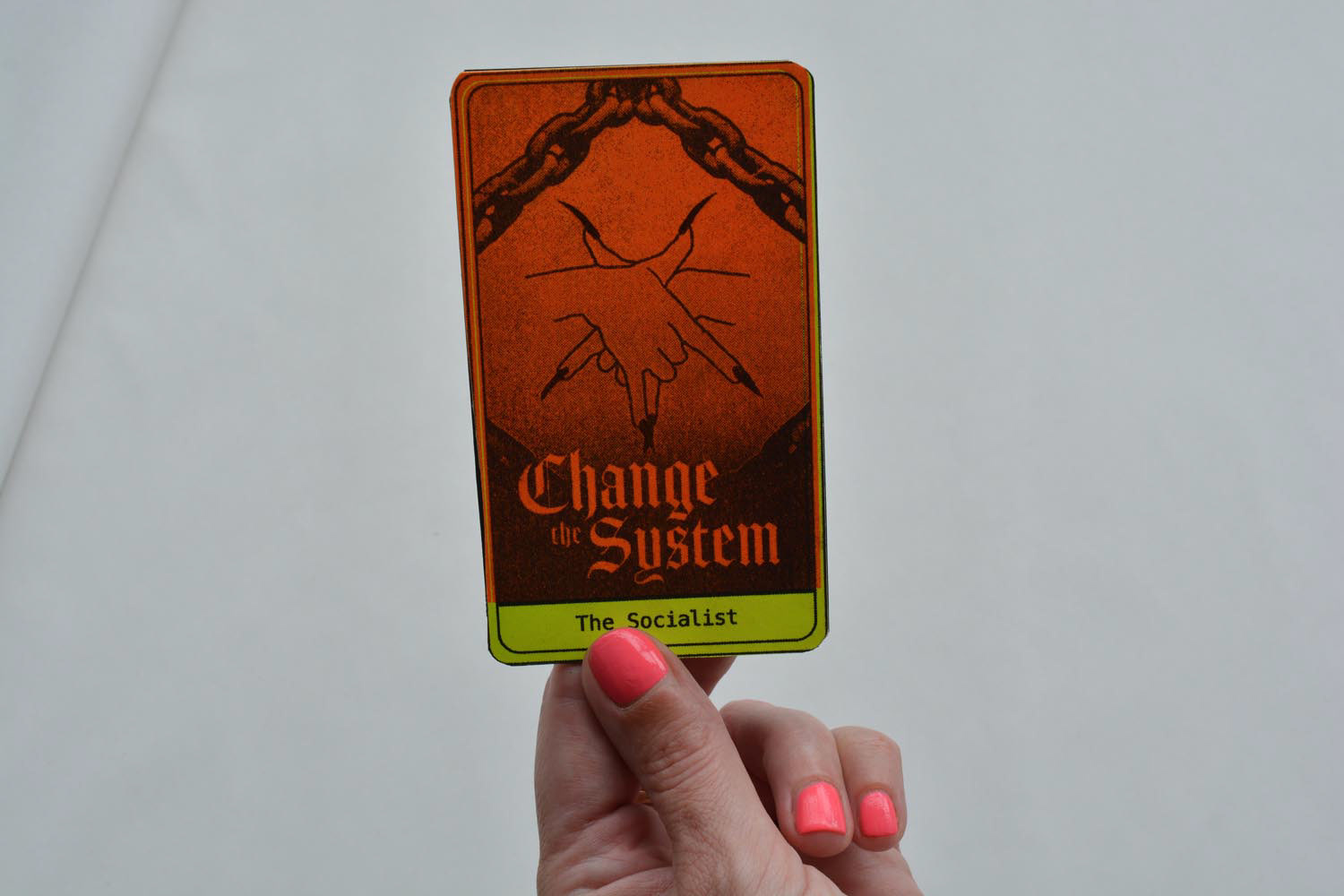
The Amicus is accompanied by four Tarot-inspired cards which represent four different branches of feminist philosophy: Radical, Liberal, Social and Intersectional. Each card is inspired by the design of the Rider Wait Tarot deck (one of the most popular, most established decks) and Risoprinted onto 280gsm card stock to create a vivid colour. Within the Amicus is a hidden guide to the cards, each with an introduction to the ideas of the branch, its shortcomings, and a further reading suggestion list.
