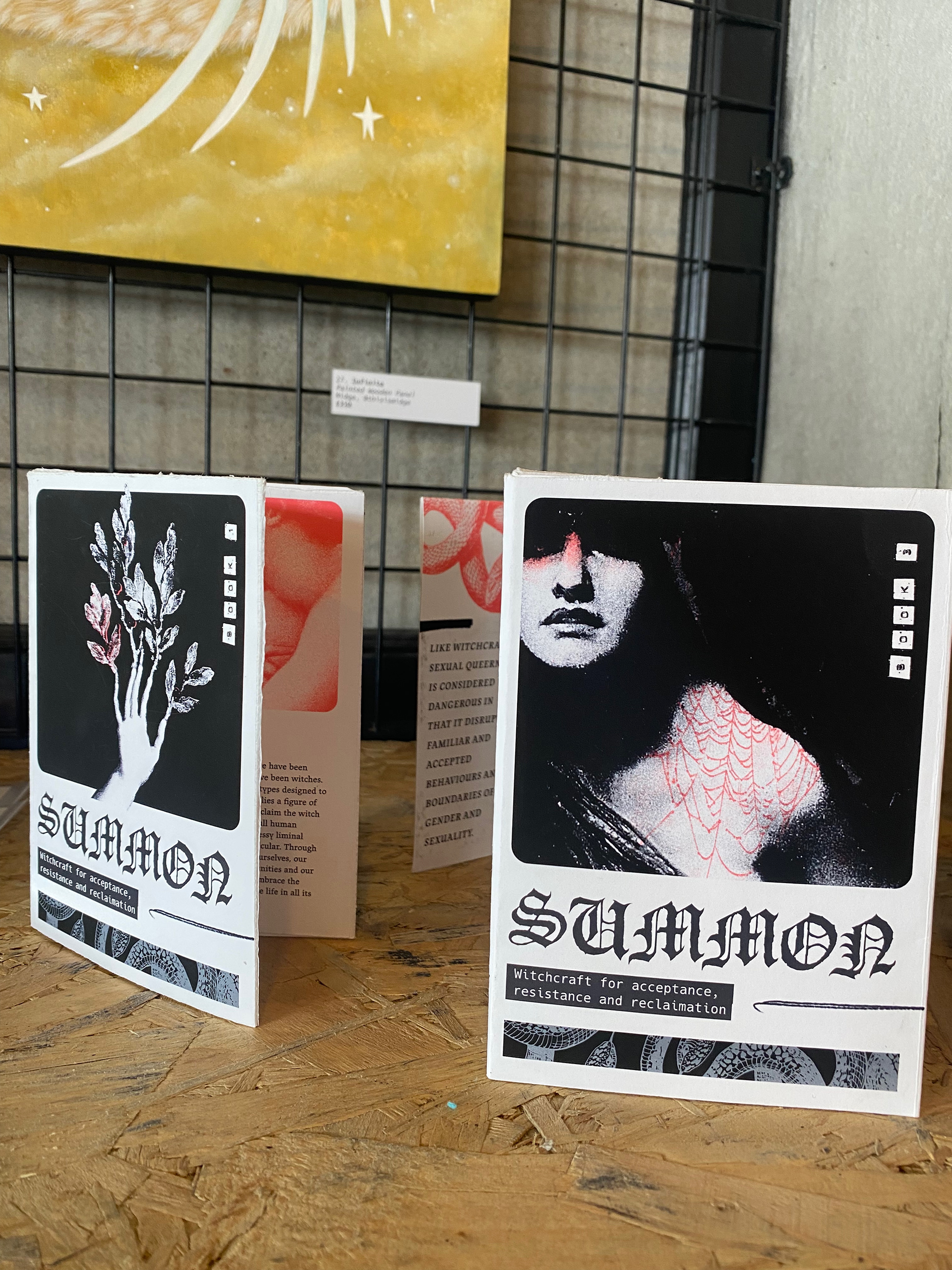
Summon Zine
Witchcraft for acceptance, resistance and reclaimation
Editorial, Print
OVERVIEW
Summon: Witchcraft for Acceptance, Resistance and Reclaimation is a series of three zines created for Love Reclaimed by The Corner Collective gallery in Portsmouth, UK.
As part of the Portsmouth Pride 2025 events, Love Reclaimed centred around the theme of queer love being an act of radical resistance in a world that continuously tries to define love within heteronormative frameworks.
I created a three part zine series exploring the intersections between self love and reclaiming your identity with Queer Love and Trans Love (both love between Trans people but also a love for the Trans community that is facing intense prejudice) and the image of the witch.
Objective
The zine was designed to encourage readers to rethink love in all forms as an act of both magic and also resistance. Themes of power, self agency and protest are explored through material sourced from The Modern Craft: Powerful Voices on Witchcraft Ethics edited by Alice Tarbuck & Clare Askew. As it was an open brief, there was also the opportunity to set the art direction best suited to explore the themes of Love Reclaimed in a way that encouraged conversation whilst being aesthetically striking.
Process
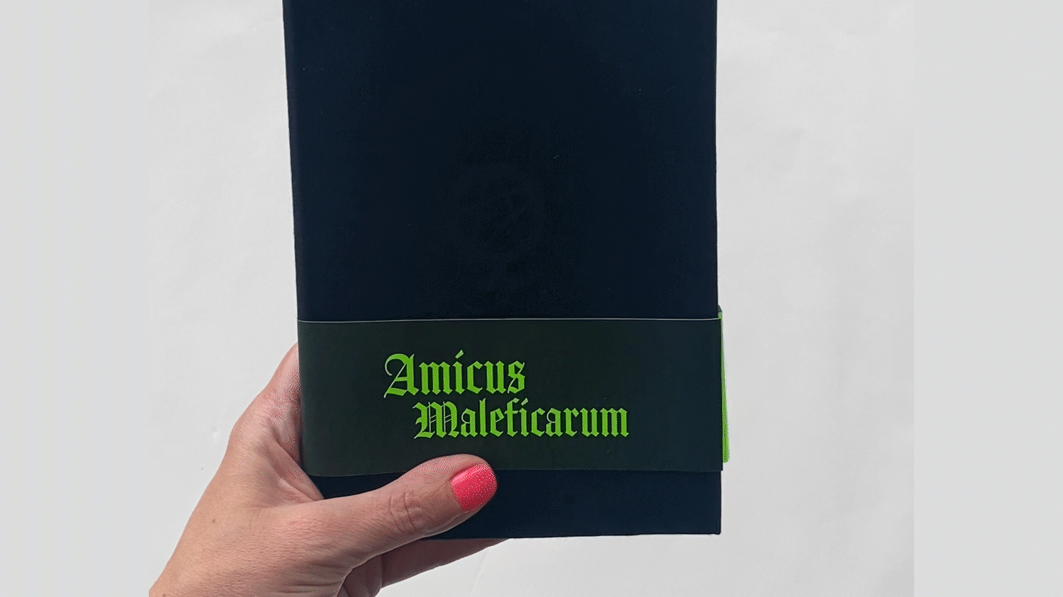
The zines were created to unite the themes of witchcraft and queer existence. Both of these topics are counter culture to the mainstream and also have been considered taboo subjects. The intention of the zines was to create pocket spell books that reassured and empowered though their content.
Whilst Pride is rightly associated with bright, rainbow celebrations of human love, I wanted this zine to act as a visual juxtaposition to the established visuals associated with queer love. The content was about acts of rebellion and resistance after all. To celebrate and centre the wisdom in the quotes selected I focussed on framing them with an asymmetric grid layout that balanced white space with type hierarchy and bold graphics.


OUTCOME
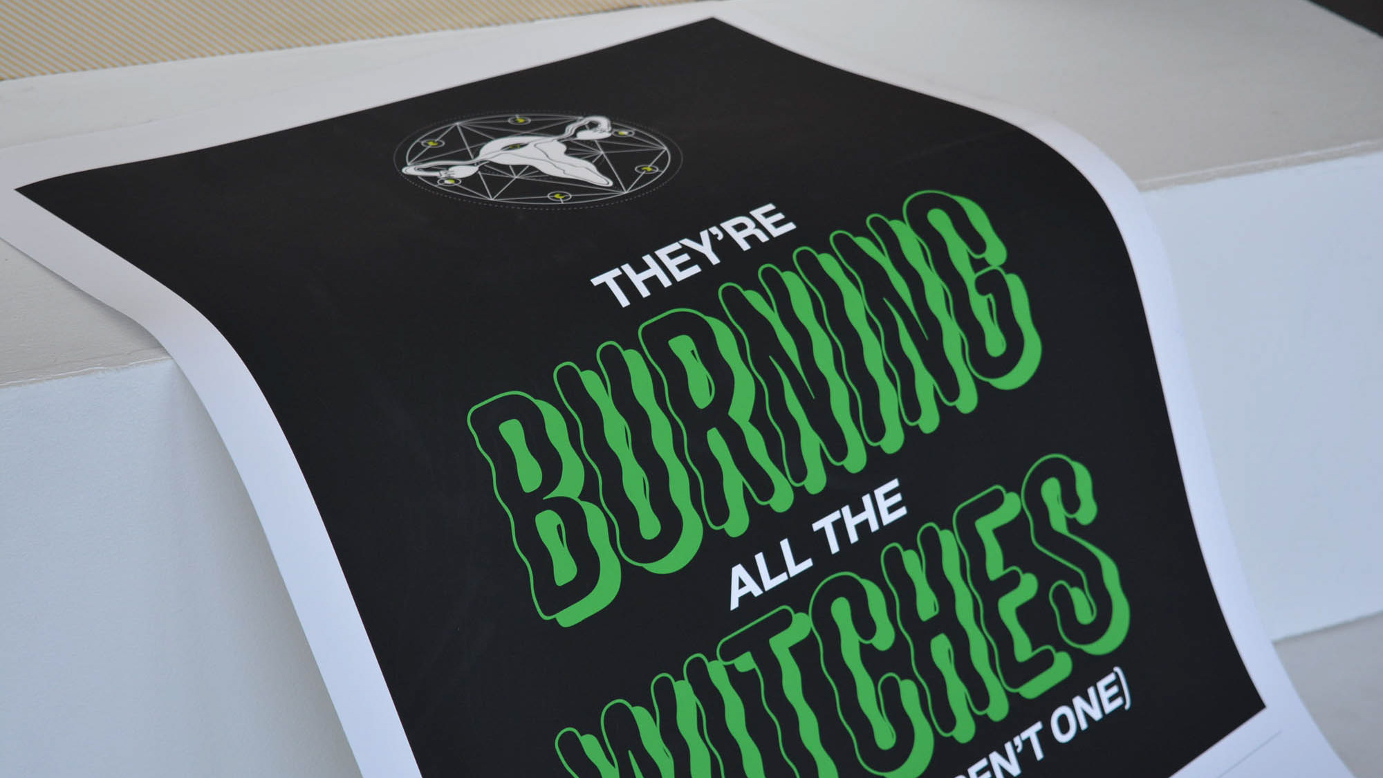
The art direction is restricted to a primal palette of red and black, with red being a highly emotive colour of not only love, but anger, blood and rage. This further played into the idea that love is not a two dimensional, Hollywood-esque romantic flatline, but a vibrant kaleidoscope of human experiences.
Image choices centred around mythology inspired Renaissance and Baroque art to give a sense of retelling familiar narratives or looking at familiar scenes with new perspectives. Images were treated in Photoshop to create high contrasting shadows and Risoprint look with added grain and texture.
Typography choices include a modern blackletter inspired font in JAF Lapture. The various weights enabled me to use the font through body text, pull quotes and for titles within the zine. I wanted to use a blackletter-esque choice to bring in echoes of rewriting the established, as blackletter fonts draw connotations of tradition, impact and elegance. They also work well in this project as it ties into the visual language of 1950s horror movies and the occult.
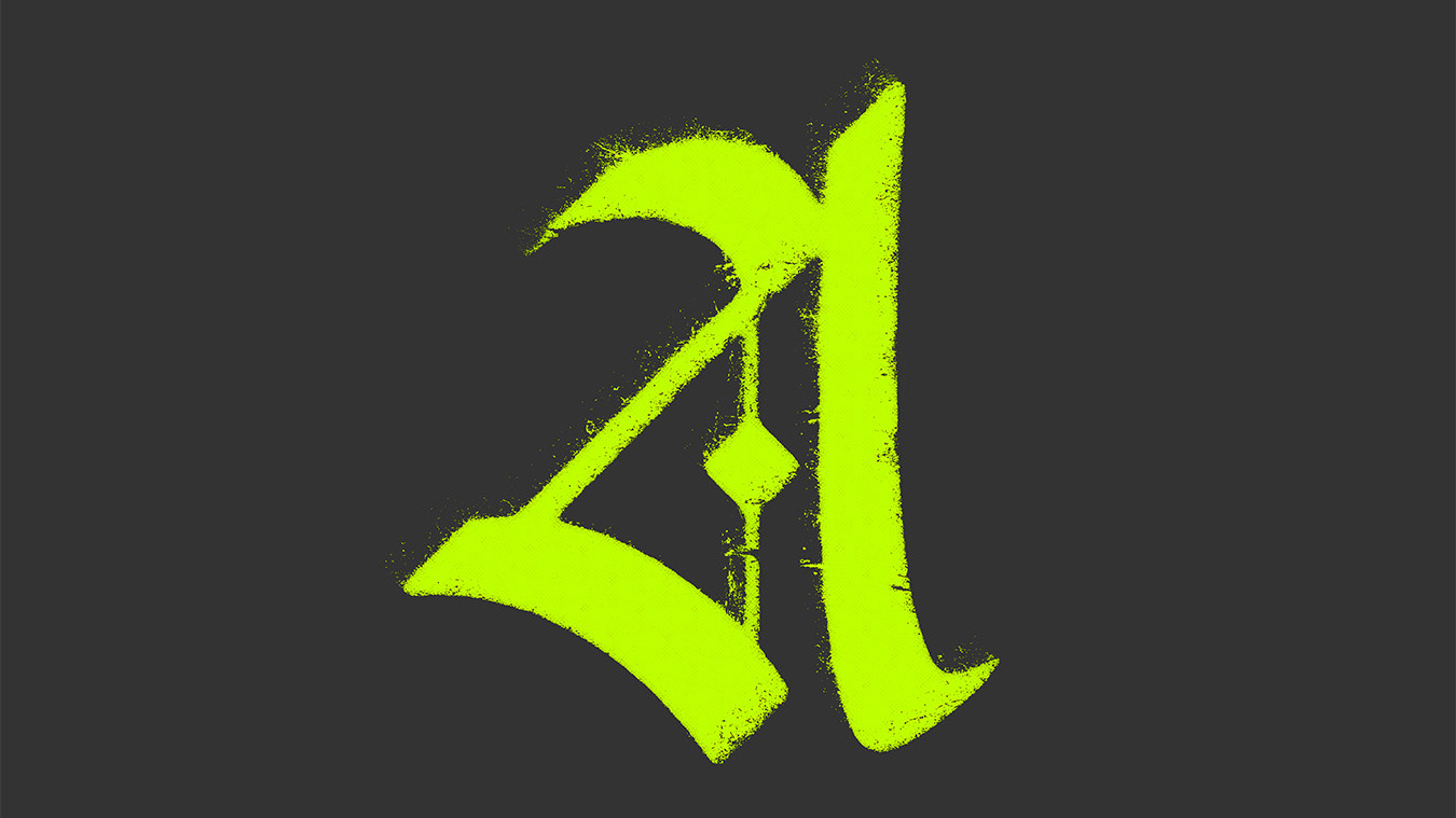
In order to really lean into the counter cultural narrative that unites witchcraft and queer love, I chose to use a title type that was visually distinctive. Siege Engine by Spear Head Media Ireland is a heavily distorted display font designed originally for heavy metal and punk aesthetics.This not only tied the project to its roots in ‘alternative culture’ but the manuscript calligraphy echoes of the letterforms played into the idea of the zines being miniature spell books for activism wonderfully.
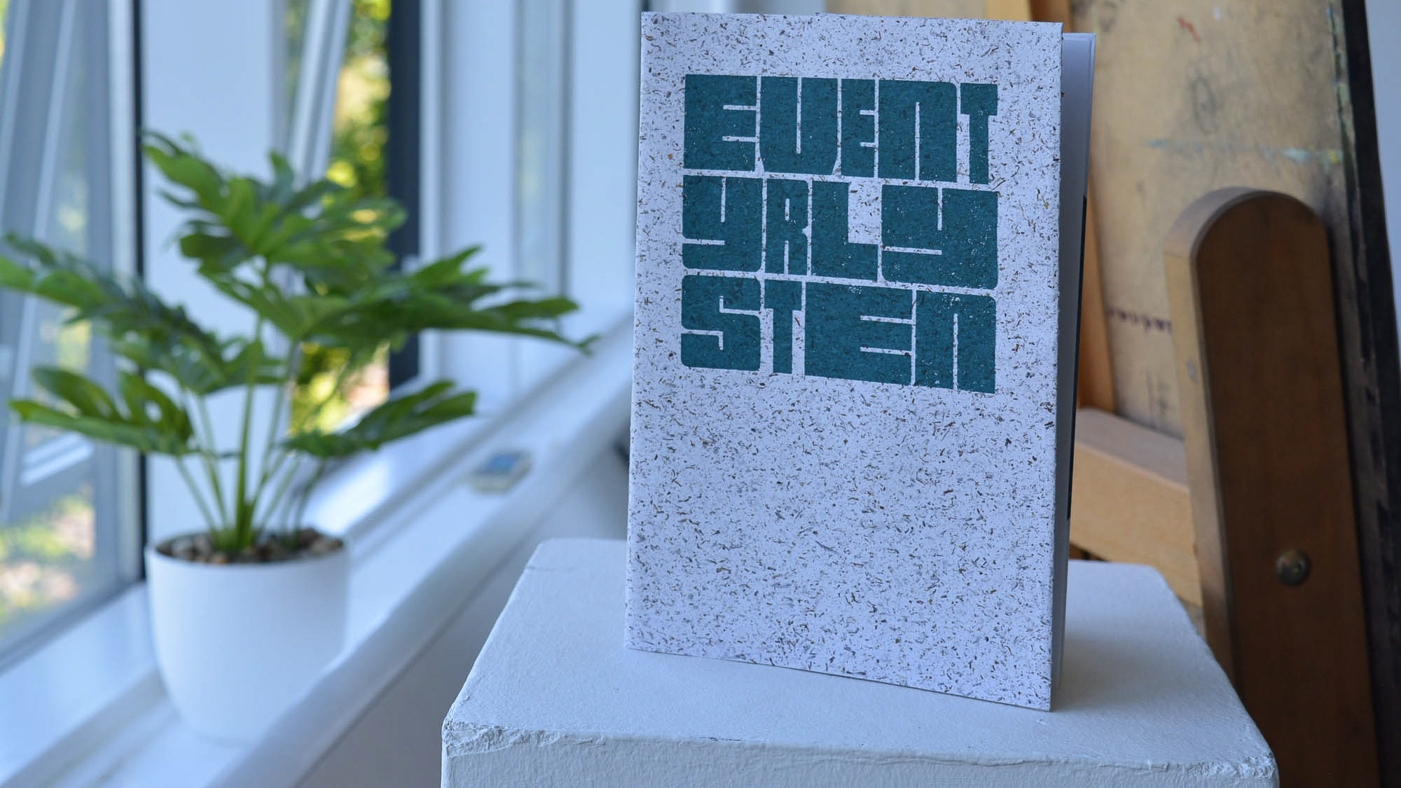
I paired these decorative font choices with the monotype Hack. This feels utilitarian compared to the display fonts used on the cover and the refined blackletter of the zines content. For this reason it acts as navigation on the covers and ties into my own personal branding.
RESULTS
Summon: Witchcraft for acceptance, resistance and reclaimation was my first foray into exhibiting and resulted in my first zine sales. As a result the zines will soon be available to purchase online.
Read more about the show and the design process of the zines on my blog here.


Tools: InDesign, Illustrator, Photoshop
Printer: Vivid Print on Draft, University of Portsmouth CCI studios
Title Font: Spearhead Media Ireland
Printer: Vivid Print on Draft, University of Portsmouth CCI studios
Title Font: Spearhead Media Ireland