Night School Brand
by SheSays
by SheSays
Creative Direction, Brand Design
Overview
Night School by SheSays is a short-form online content series that allows the SheSays community to learn from unexpected guides and mentor with real life experience of the skills they are teaching. Through pre-recorded lessons, worksheets and homework, Night School participants are tutored by people who’ve mastered their craft, overcome common challenges and want to pass on their knowledge to help more women and non-binary people succeed in their careers.
I was approached to help realise the visual direction of the project as the aesthetic needed to be alternative, witch-inspired and nocturnal.
Objective
Night School needed to be a distinctive brand separate but linked to the SheSays identity.
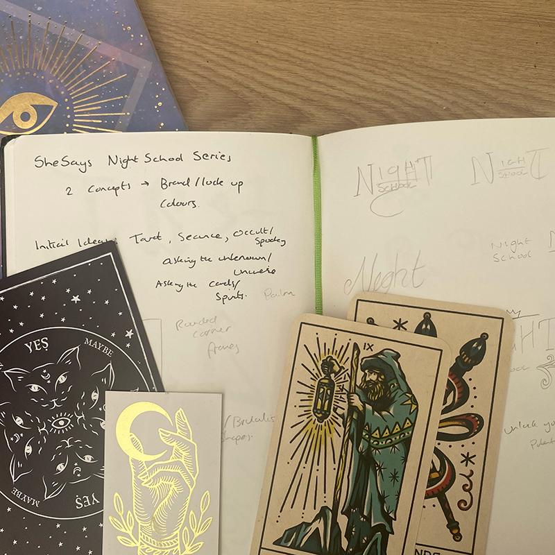
Inspired by the nocturnal theme of a night school, the brief was to create an identity that celebrated the alternative knowledge that is available in the real world through lived experiences. This idea of alternative knowledge felt in tune with images of magic and sorcery and the visual direction of modern mystics and witchcraft began to emerge.
The design systems created needed to be distinctive but versatile enough to be used across a range of touch points. They also needed to be easily implemented by all team members.

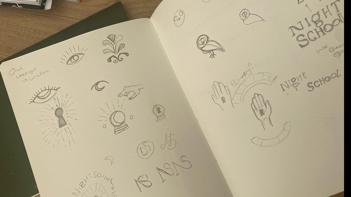
Process
The brand design from Night School was rooted in the idea of modern methods combining with lived experience to create a new system of wisdom.
I decided to use a combination of contrasting and opposing design elements to create a sense of old meets new, tech meets human, past meets future.
Night school is a collaborative effort which looks to celebrate wisdom that isn’t always traditionally valued, so it made sense to lean into two main areas when creating the visual direction:
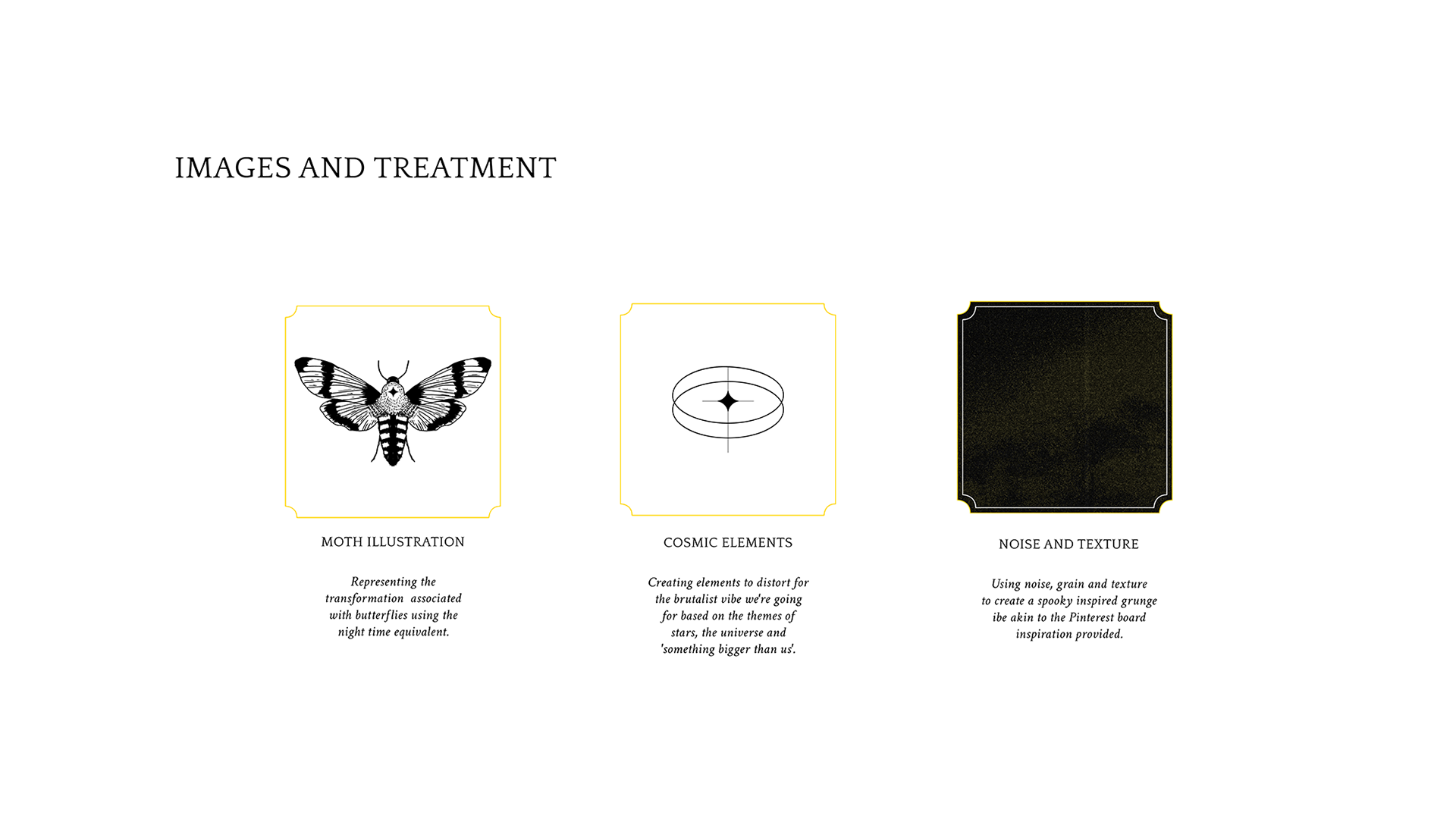
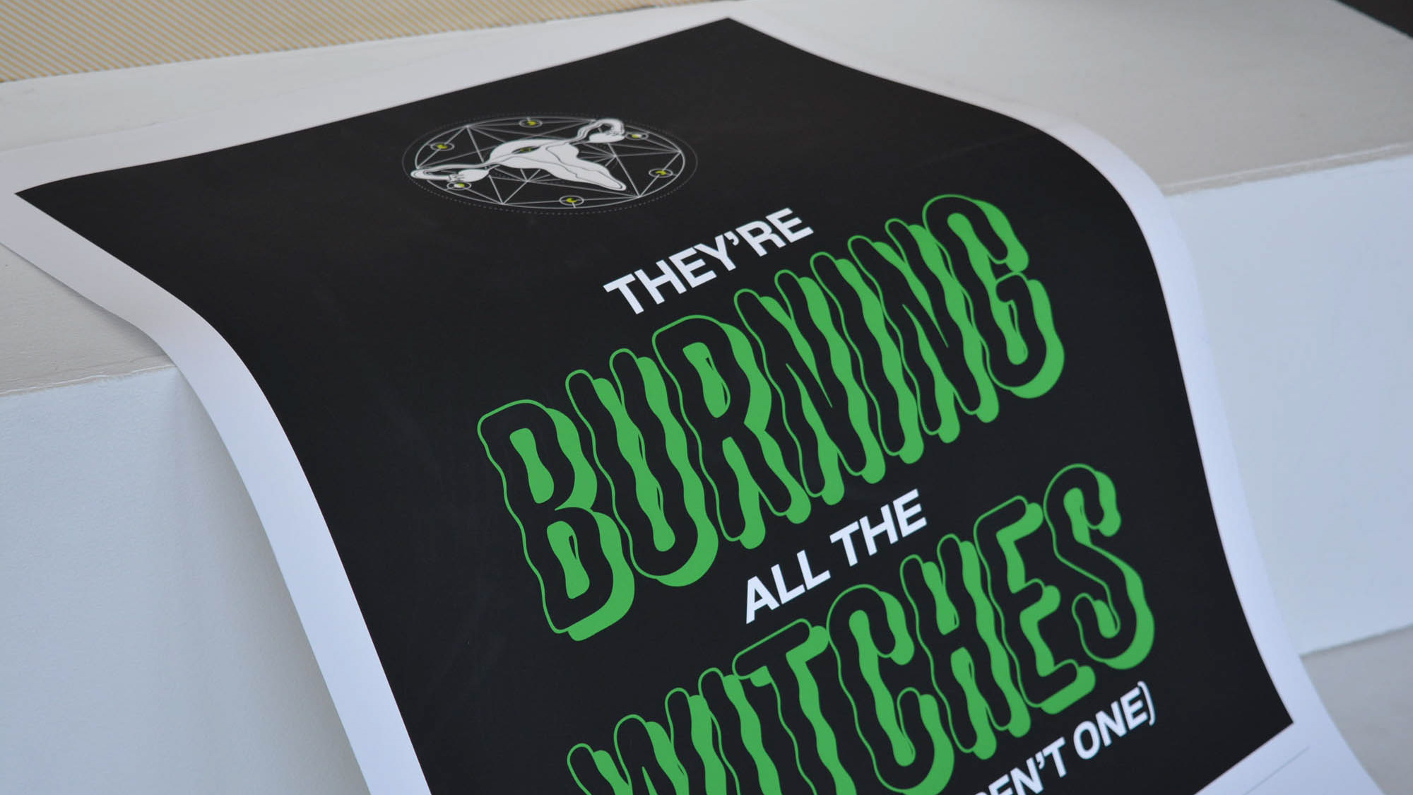
1) Alternative wisdom represented with a spooky, dark aesthetic that draws on the themes of the esoteric, astrology and clairvoyance.
2) Modern methods represented by sharp lines, structured grids inspired by matrix style lines and geometric shapes to represent themes of the future and learning on a digital landscapes.


Outcome
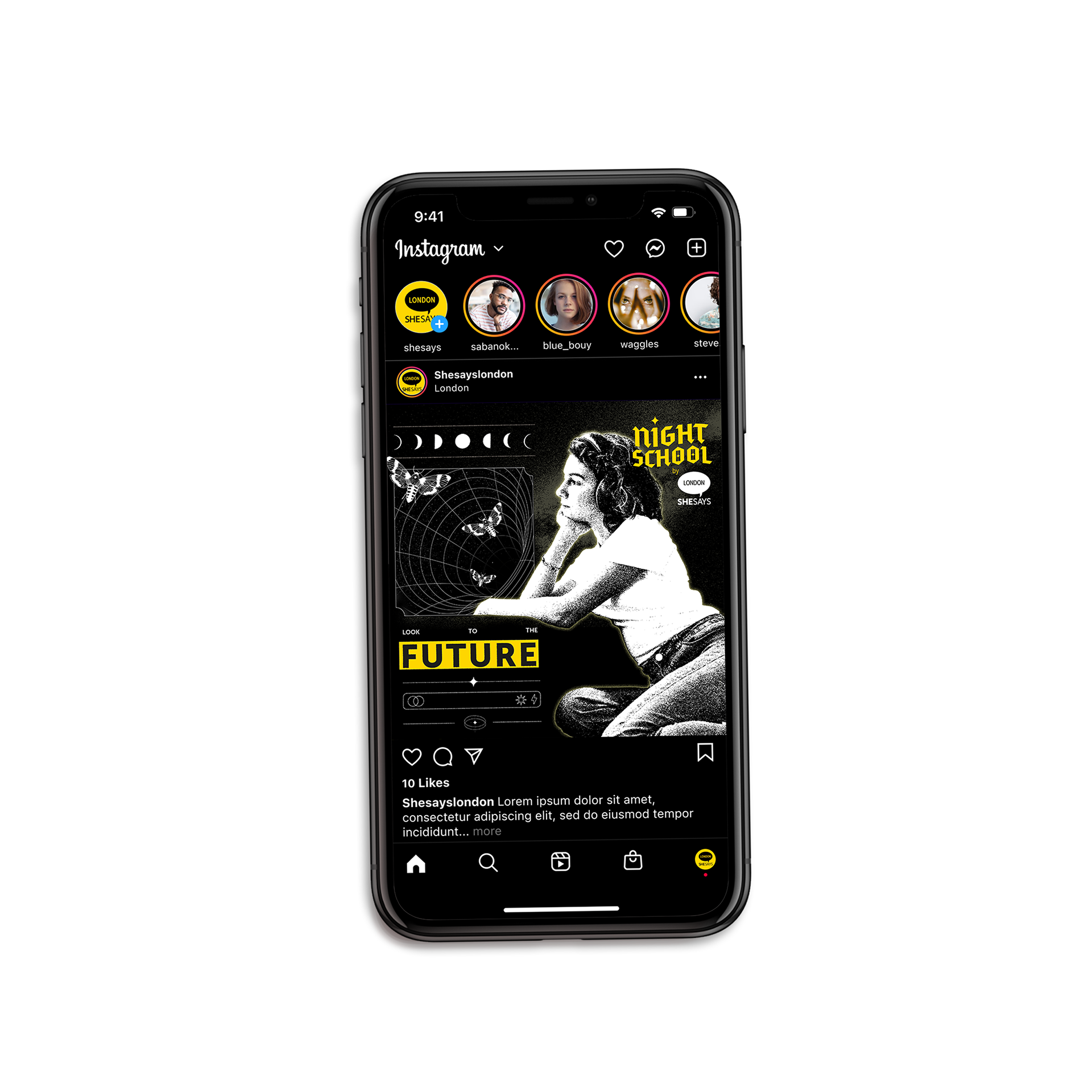
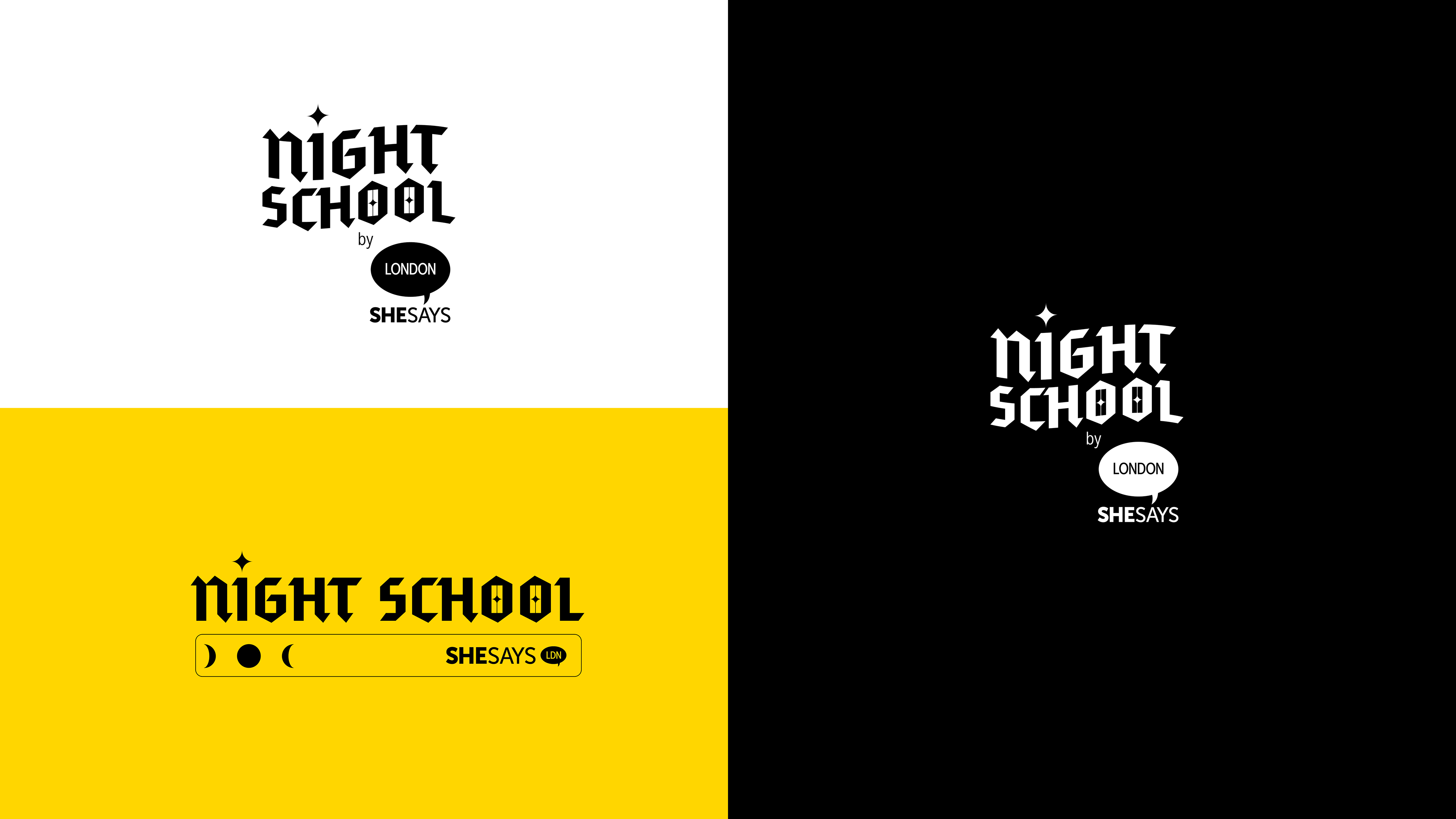
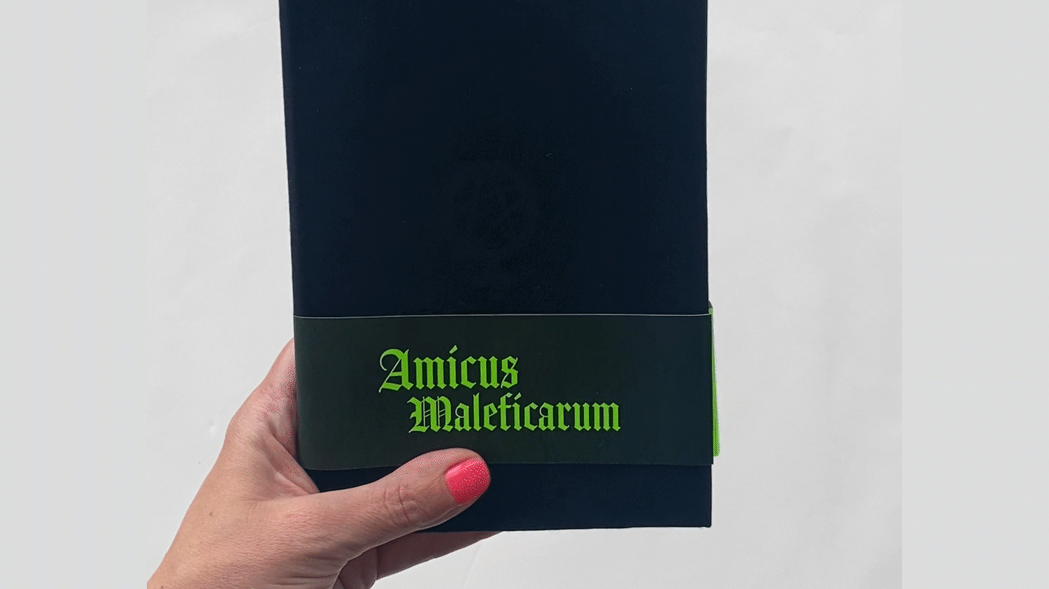
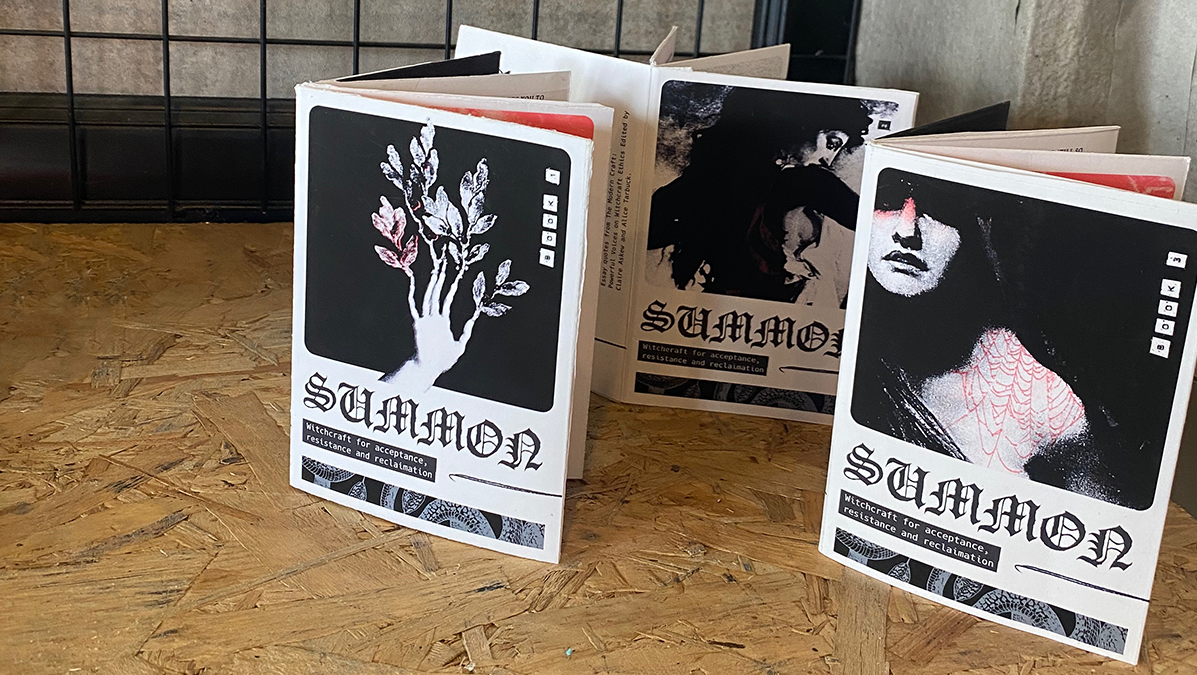
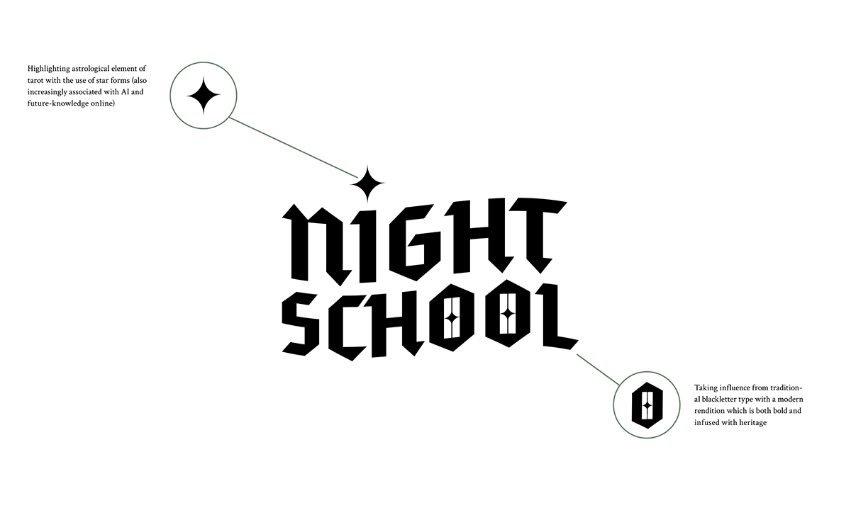
The main logo takes influence from traditional blackletter type with a modern rendition which is both bold and infused with heritage. I also used curved star shaped within the logo to both reference traditional calligraphy marks but also AI and tech which is fast becoming associated with the ✨emoji. Taking inspiration from blackletter writing brings a senseof established authority to the type, whilst the sharp edges and slight wave shape ands a sense of modernity and playfulness.
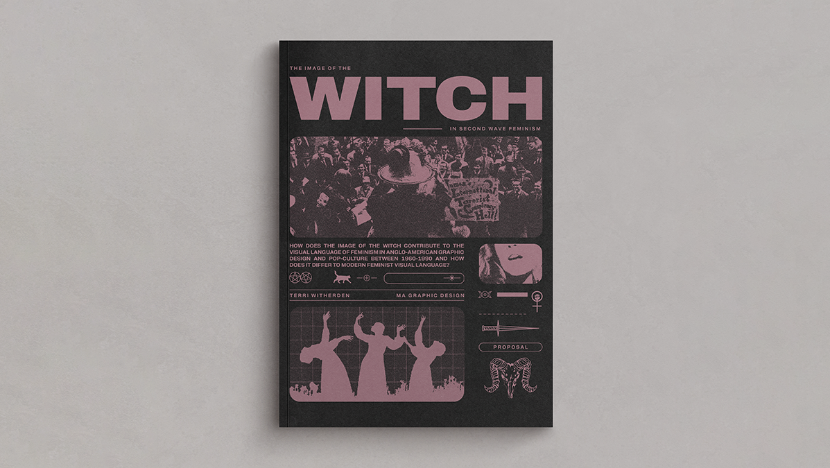
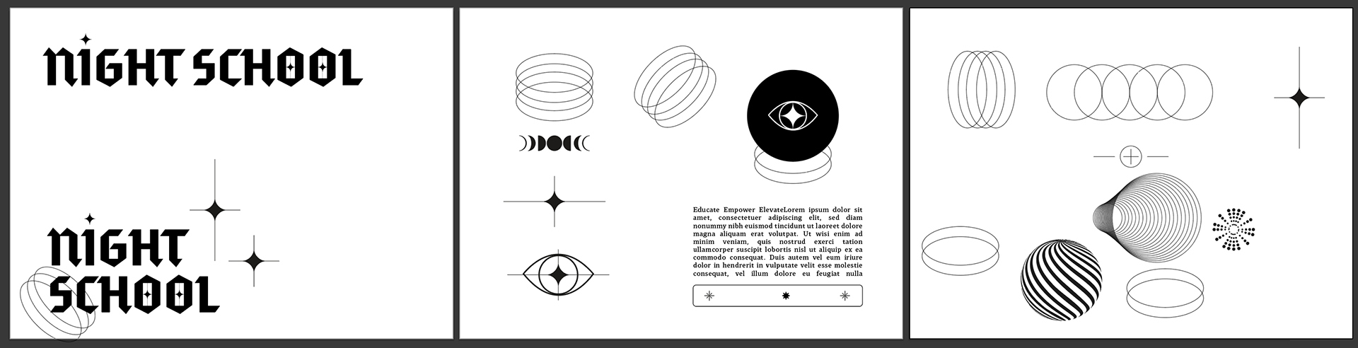
The colours and logo lock up incorporate the SheSays logo and help tie the distinctive logotype back to the parent brand. To build the brand out further I developed more graphic elements that can expand the brand across different formats. These were created with a combination of Brutalist symbols and influenced by Y2K style graphics, once again referencing the theme of ancient wisdom meeting modern methods.
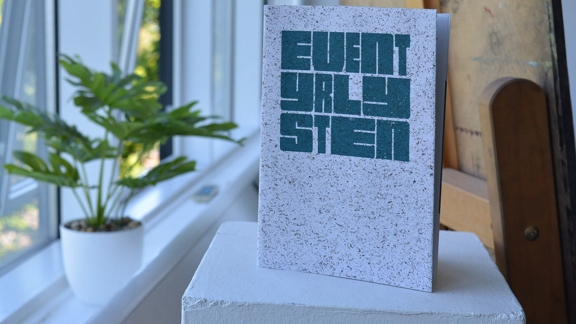
Image treatment within content associated with the brand would be high contrast greyscale with a high threshold and texture. This balance of inky textures and paper grains when combined with the sharp angles of the logo and graphics created and contrast of physical and digital and helped pull through the concept that this is learning from people, not robots or AI, into the brand identity further.
Tools: Illustrator, Premier Pro, Figma, Photoshop, Google Slides
Collaborators: SheSays London
Collaborators: SheSays London