The Image of the Witch in Second Wave Feminism
Graphic Design MA, University of Portsmouth
Editorial, Print
Overview
The first assignment for my MA in Graphic design was to research and develop a project proposal for my major project due on completion of my MA in 2024.
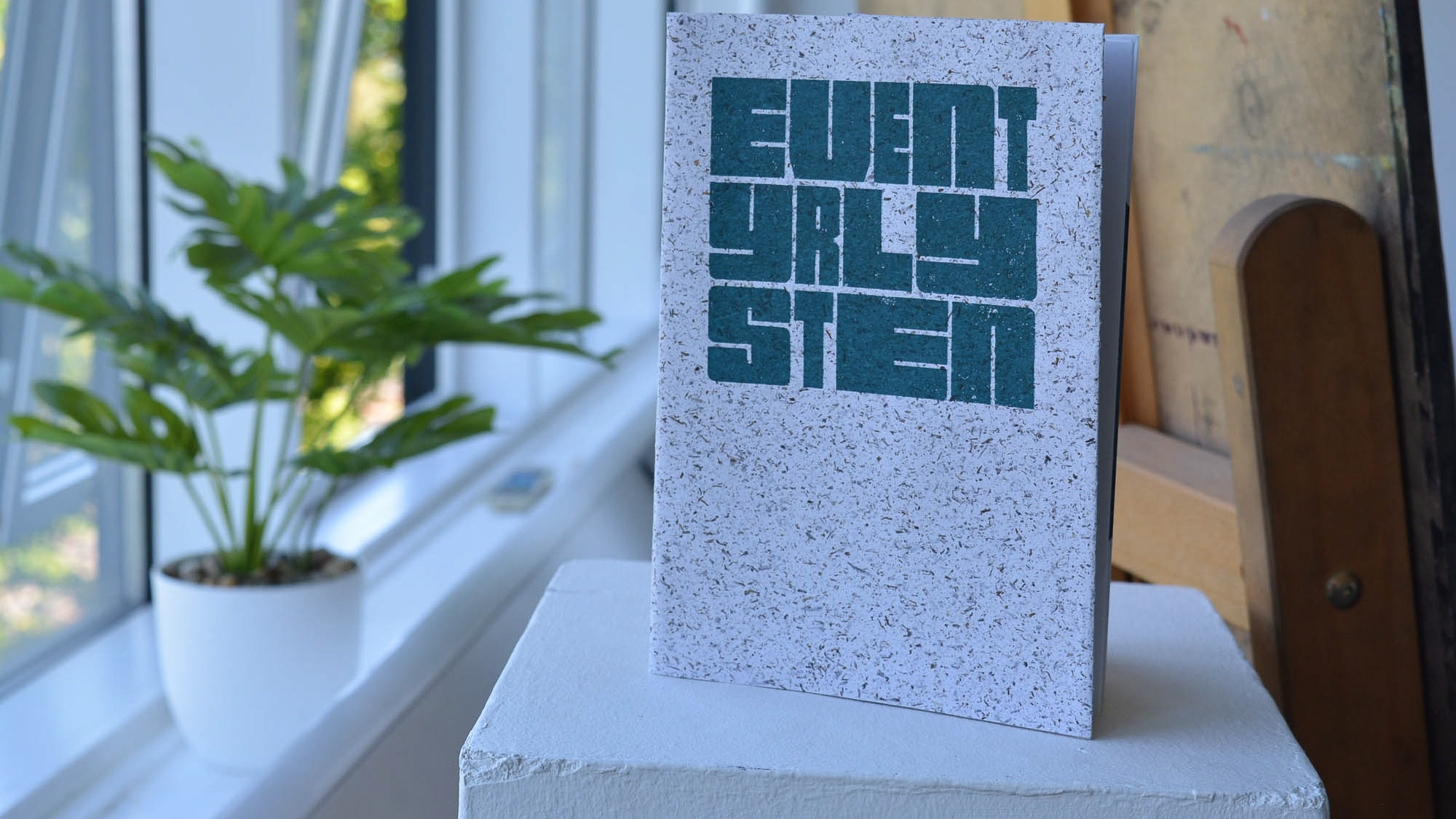
Through academic research, explorative practice and guidance from my lecturers and peers, I developed and focused my research question around the image of the witch and second wave feminism. Developing an initial research question, I designed my submission as an editorial piece including a a literature review, images of my initial practice based enquiry, a project action plan, and a bibliography.
Research and Development
Inspiration for the project came from observing the casual sexism present in everyday media. In particular I was interested in how female celebrities (in particular Taylor Swift) are often treated unfairly and unfavourable once they get a little too 'big' or powerful.
This lead me to start exploring the relationship between women and power in society and to observe how over the course of the 19th century, the image of the witch transformed from an insult to a reclamation of power, especially amongst feminist movements.
I focussed on the second wave of feminism (1960- 1990) in particular as witchcraft was officially decriminalised in 1951. Throughout popular media between 1960-1990 the image of the witch turned from a villainous hag to an aspirational figure. I wanted to explore how and why this happened and to identify if the witch was a feminist figure or just another means of mass consumerism used to make women feel 'othered' in a patriarchal society.


Strategy
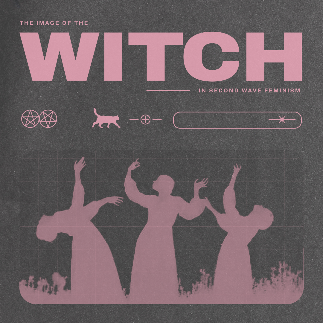
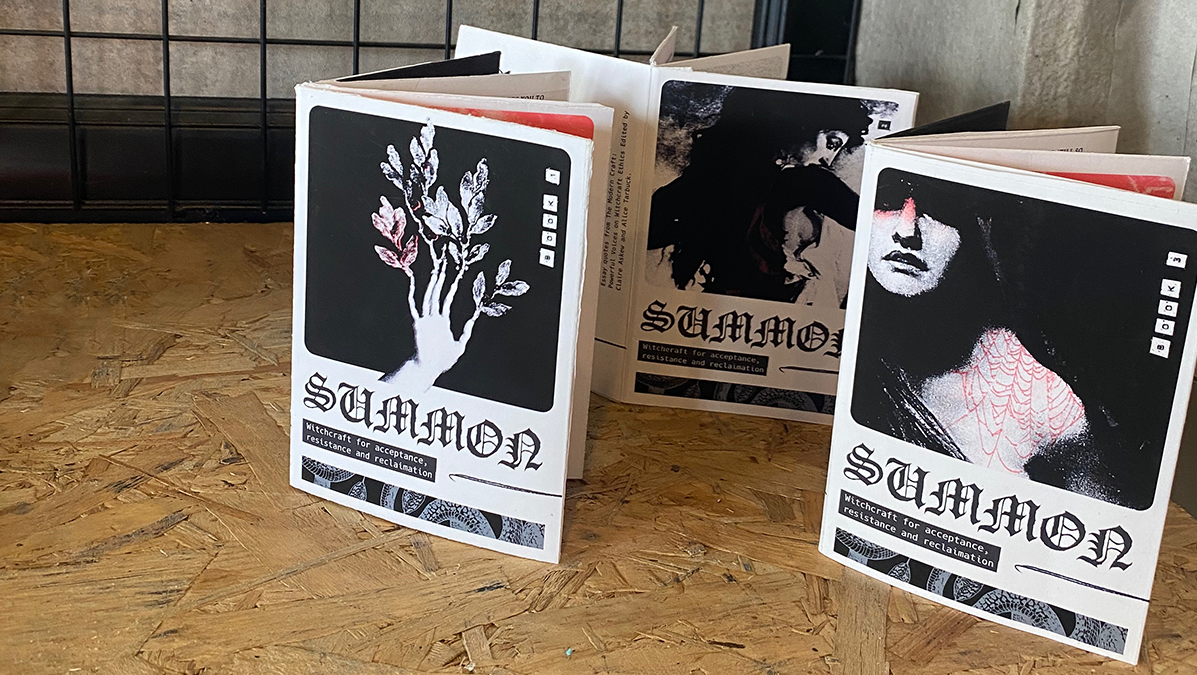
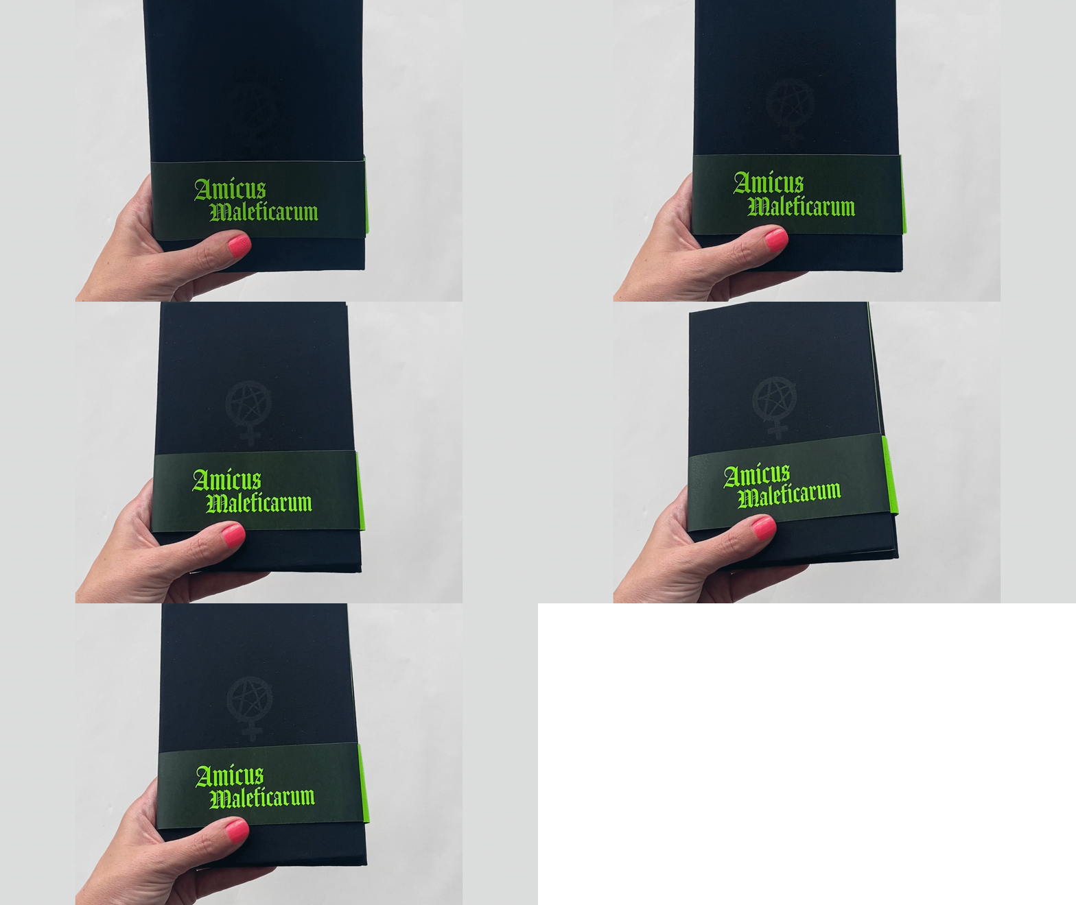
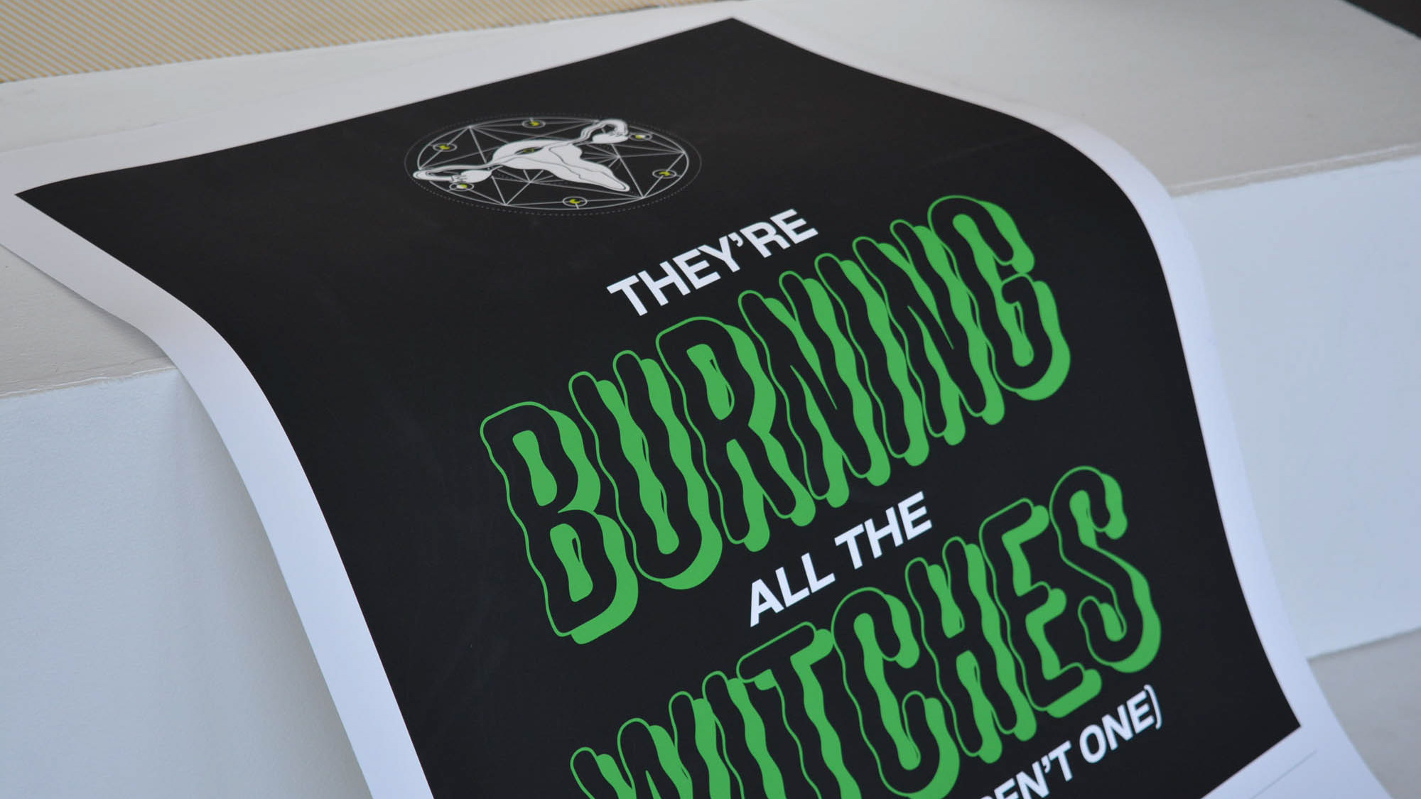
Throughout the project I wanted to convey the relationship between female power and the supernatural connotations of the witch and counterculture. Exploring symbols such as cats, snakes, pentacles and icons of the Women's Liberation movement, I created a visual identity for my proposal that echoed both witches grimoires/spell-books but also punk zines of the 1970s.
Outcome
Using heavily textured images, a soft 'baby' pink to contrast the heavy subject matter and typographic hierarchy, I presented an convincing 5000 word argument that supports the historical and contemporary relevance of this study.
The next iteration is to explore the commercial use of the witch in graphic design in order to identify if it's visual grammar is authentic in promoting equal rights, or if it has been commodified and 'sold out' in order to support the existing structures it traditional opposes.
